STRATEGY
While the category sought legitimacy by looking outward, Petra looked to the sophistication that is born here with creativity and warmth. Thus was born the purpose: To live the pleasure Brazilian way, transforming Brazilianness into the guiding thread of the brand. More than competing for space among premium beers, Petra reminds us that what is good doesn't need to come from far away.
A magnetic, creative, refined, and warm Petra, capable of building aspiration without distance. The narrative and value proposition reinforce the purpose. The origin in the mountains, the exclusive Petra Malte, and Brazilian innovation cease to be mere product attributes and begin to support a new idea of premium: with body, color, warmth, freshness, and its own unique accent.
CREATION
Based on the purpose — “To experience pleasure the Brazilian way” — we created a magnetic, creative, refined, and warm identity that invites you to “feel this Brazilian spirit” in a premium, unique, and proprietary way.
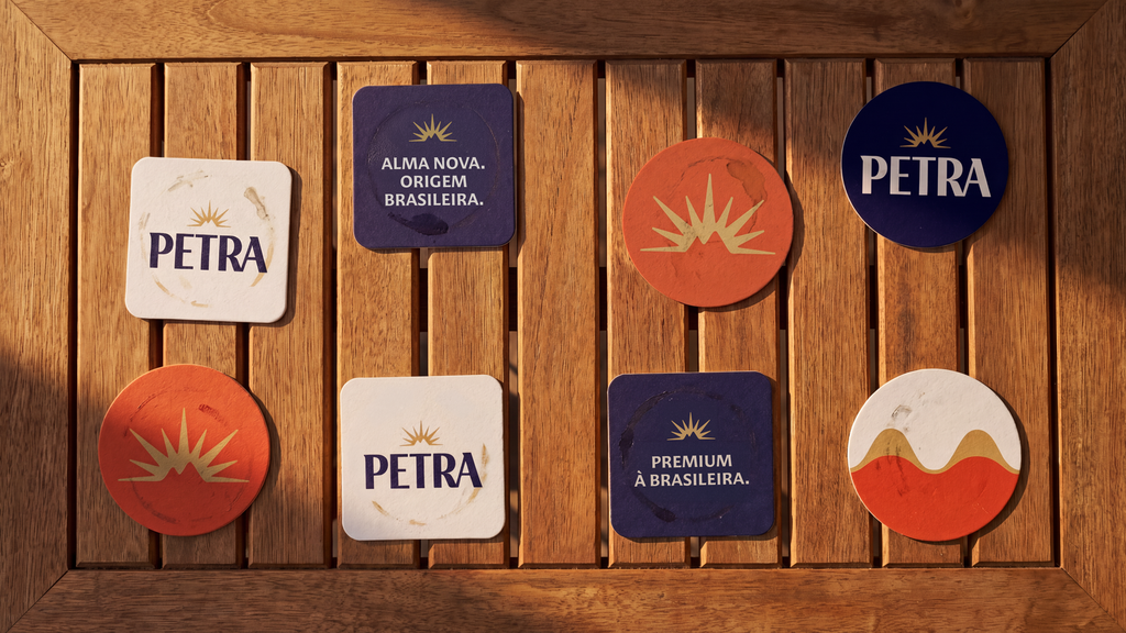
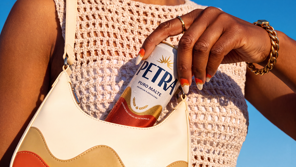
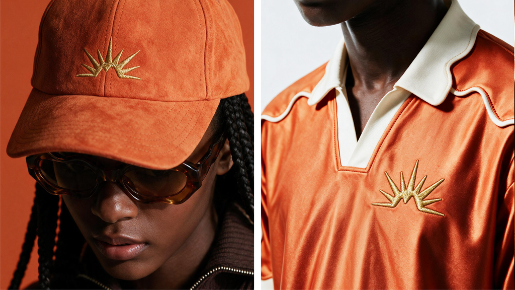
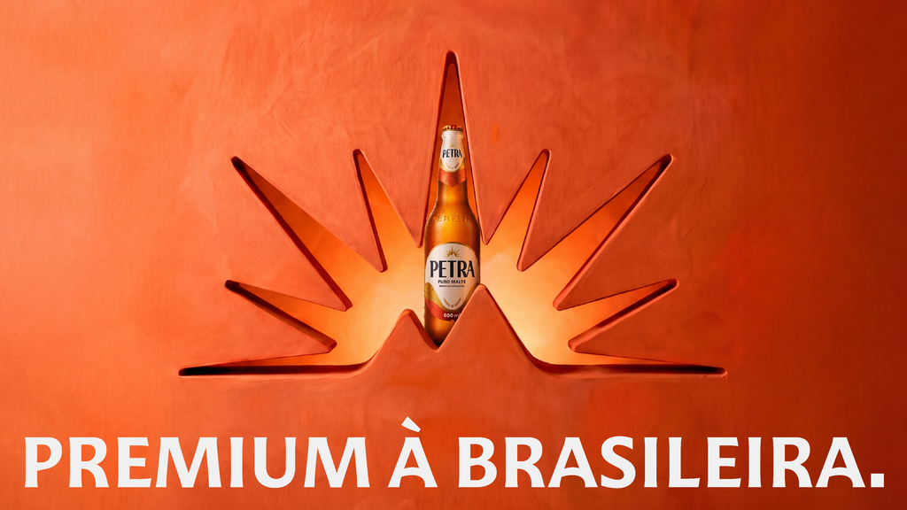
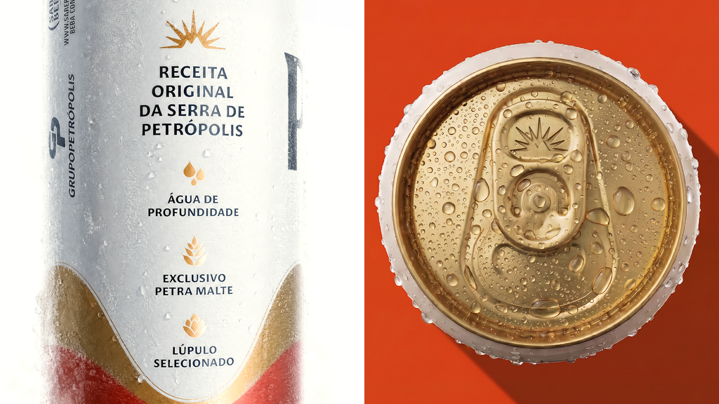
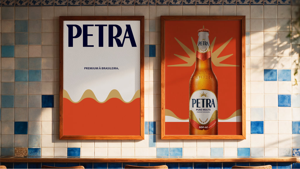
To achieve this, we refined the symbol, transforming it into a magnetic asset, more present and performative, preserving the sun and revealing, in its counterform, the silhouette of the Petrópolis mountain range. The logo's typography was redesigned to bring more presence and sophistication. Copper took center stage in the language, translating the warm and refined side of the brand, complemented by dark blue and off-white, which guarantee contrast and balance to the palette.
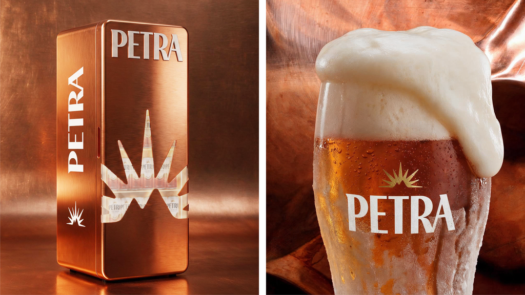
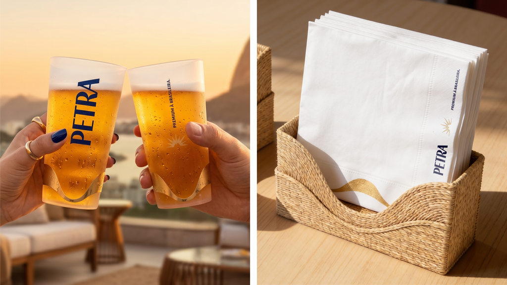
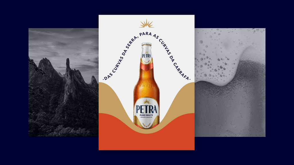
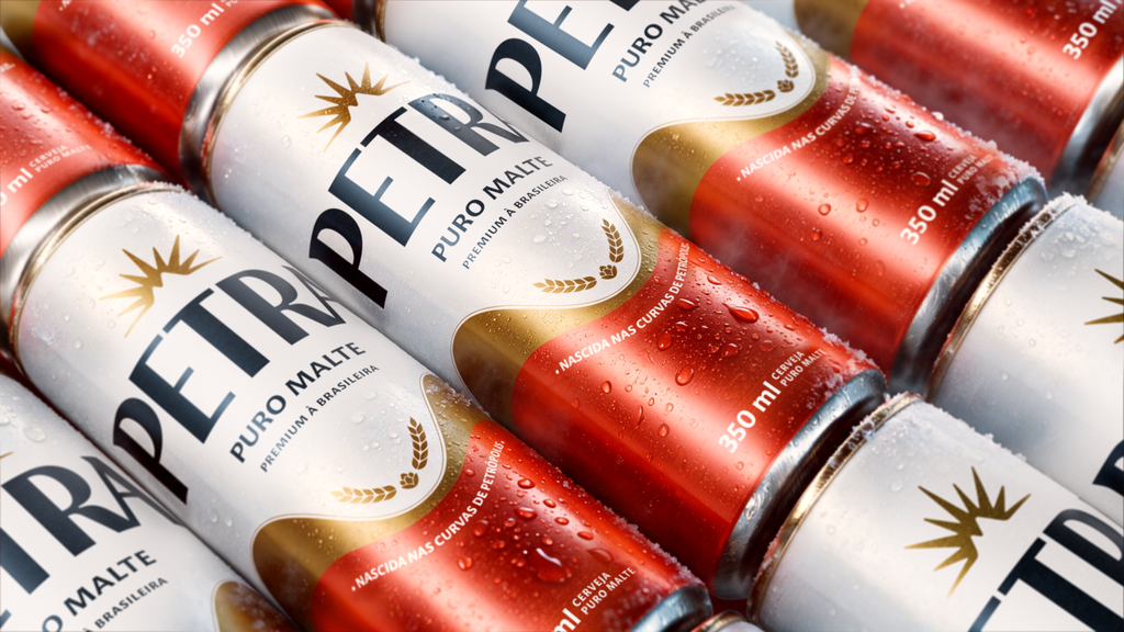
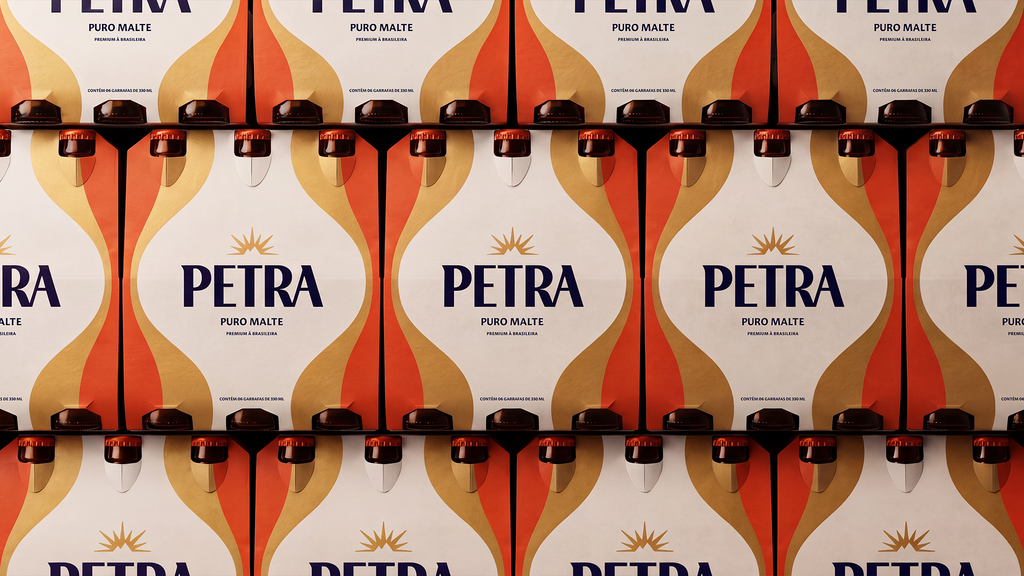
Present throughout the brand's expression, from packaging to communication, curves are a central element of Petra. Inspired by the concept of "beer that descended the curves of the mountain range," they reflect both the curves of the Petrópolis mountain range and the foam of the beer as it drips down the glass, bringing fluid and sensory movements and, at times, evoking vernacular Brazilian graphic designs, reinterpreted in a contemporary and elegant way.
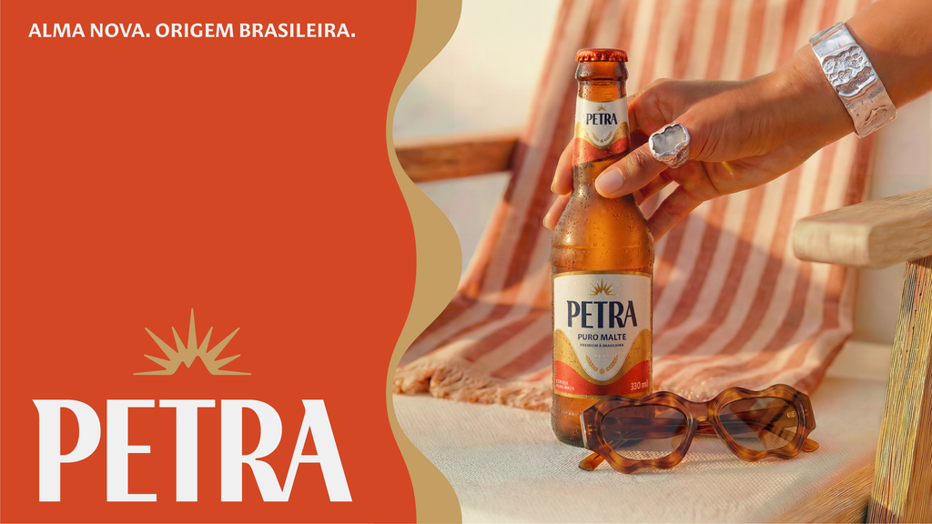
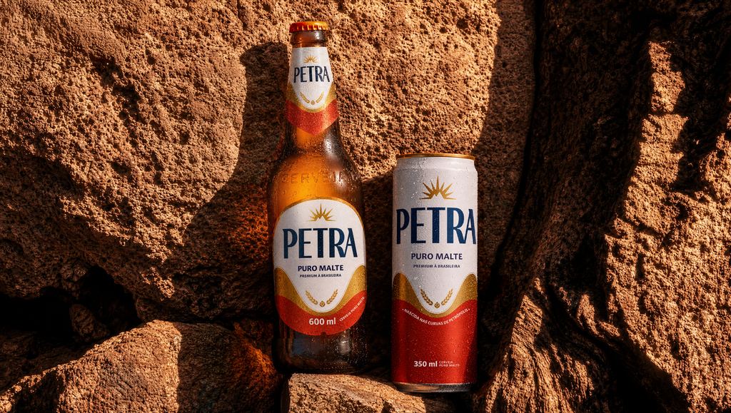
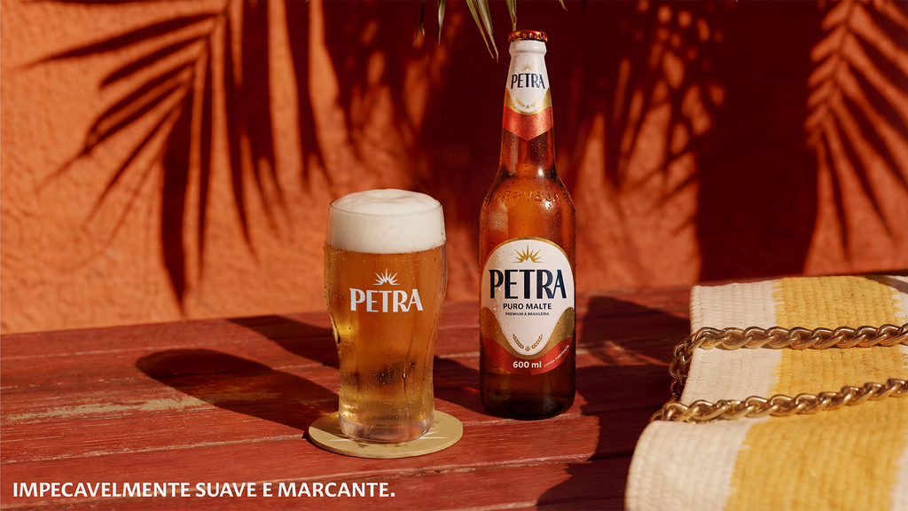
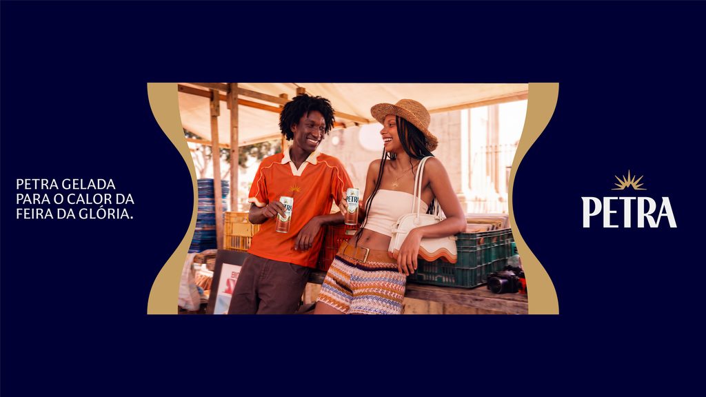
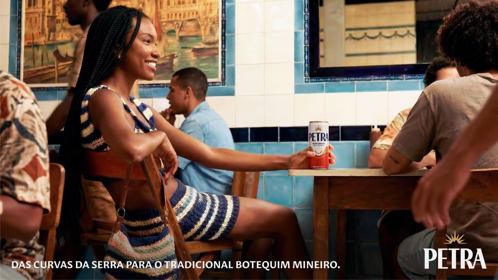
In photography, this Brazilian spirit comes to life in warm and engaging images that portray genuinely Brazilian moments of consumption: a Petra beer in a classic bar, on a boat trip through Bahia, or high in the mountains.
The result is an identity that combines Brazilian exclusivity and sensory sophistication, transforming Petra's codes into a more engaging, contemporary, and above all, pleasurable experience.
Verbal language embodies Petra's magnetic, youthful, and Brazilian personality. Her voice is seductive, captivating, and employs a sensory vocabulary that reflects the pleasure of experiencing Brazilian culture in Petra's style. The brand tells its stories by making its presence felt in traditional bars, iconic festivals, and encounters between the mountains and the sea.
PACKAGING
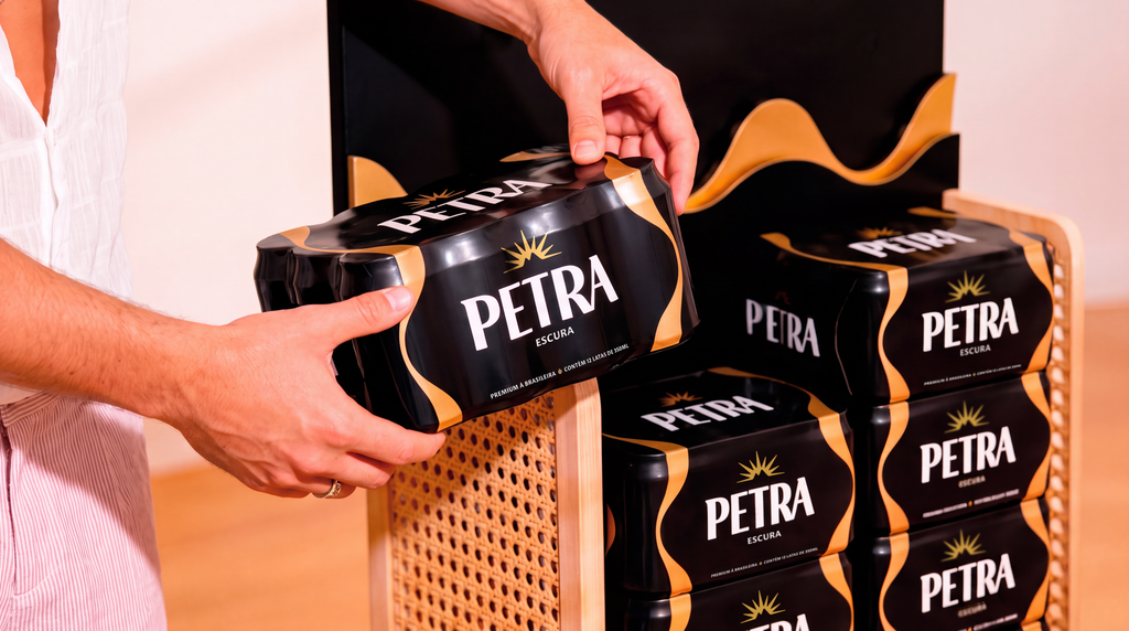
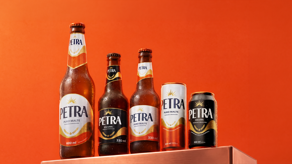
The packaging redesign stemmed from a strategic choice to evolve Petra while preserving the codes that had already built brand recognition. Throughout the process, different paths were explored, from evolutions closer to the existing universe to proposals with greater disruption, to understand how far the brand could advance without losing its identity. The final solution balances familiarity and modernization, preserving recognizable elements while elevating how Petra presents itself.
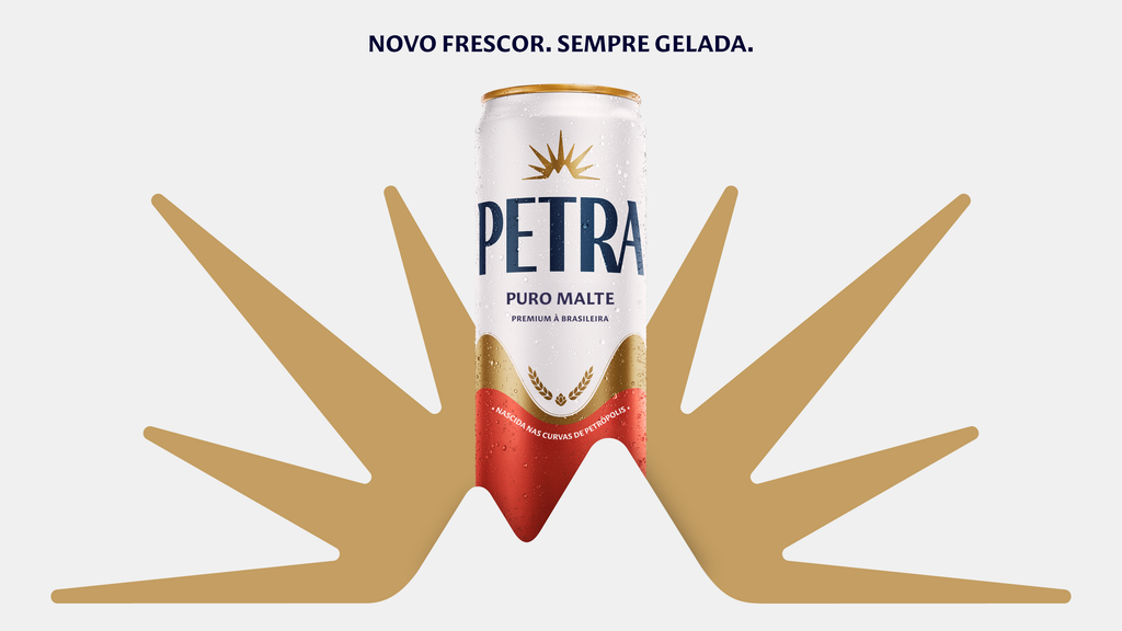
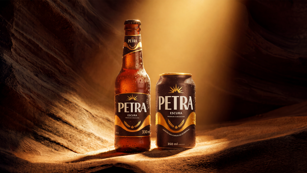
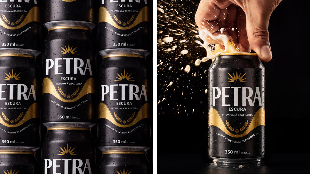
The new architecture brings more clarity, hierarchy, and prominence to the brand, with a cleaner composition and a more direct reading of the product attributes. Colors, graphics, claims, and finishes have been refined to bring more sophistication and enhance the perception of quality, connecting the packaging to Petra's new visual universe.
The project was also designed to enhance Petra's presence on the shelf, a highly competitive visual environment where recognition and impact are fundamental to the choice. The graphic design seeks to gain strength both individually and collectively, creating presence and consistency when products are displayed side-by-side. This logic extends to the entire Petra family, visually bringing the SKUs closer together and strengthening the portfolio's readability, without losing the differentiation between each label.
The result is a more contemporary, sophisticated, and desirable packaging that reinforces the perceived value of the brand and embodies in the product the new expression of premium Brazilian style.

EXPERIENCE AND POS
Petra's experience was designed to transform the brand into a physical, sensory, and memorable presence, bringing its codes, its Brazilian identity, and its consumption ritual to different moments of the journey.
The work mapped the points of contact with the consumer and the opportunities to generate impact, connection, and belonging, building a journey that evolves from the first glance to the relationship with the brand, arousing curiosity and enchantment, and creating a symbolic transition between the external world and the Petra universe.
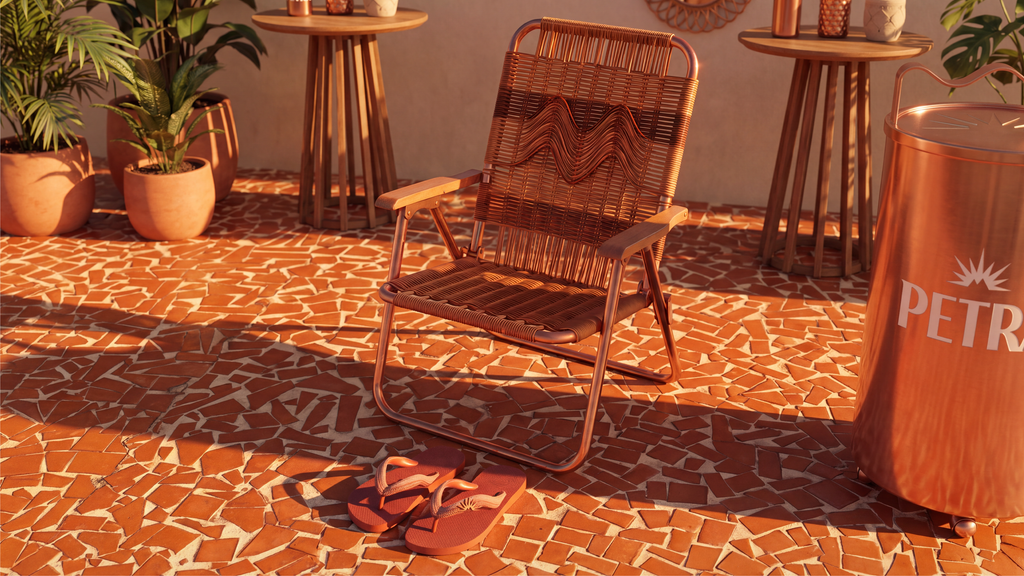
With the intention of building a striking, recognizable expression capable of generating desire, each element was designed to fulfill a specific role in the relationship with the consumer. The magnetic symbol is enhanced as a proprietary element of the Brand, gaining scale and new expressions to broaden its recognition and capture attention. Architecture, colors, shapes, light, materials, furniture, and activations work as an integrated system, translating warm curves, sensory sophistication, and Brazilian identity into different environments.
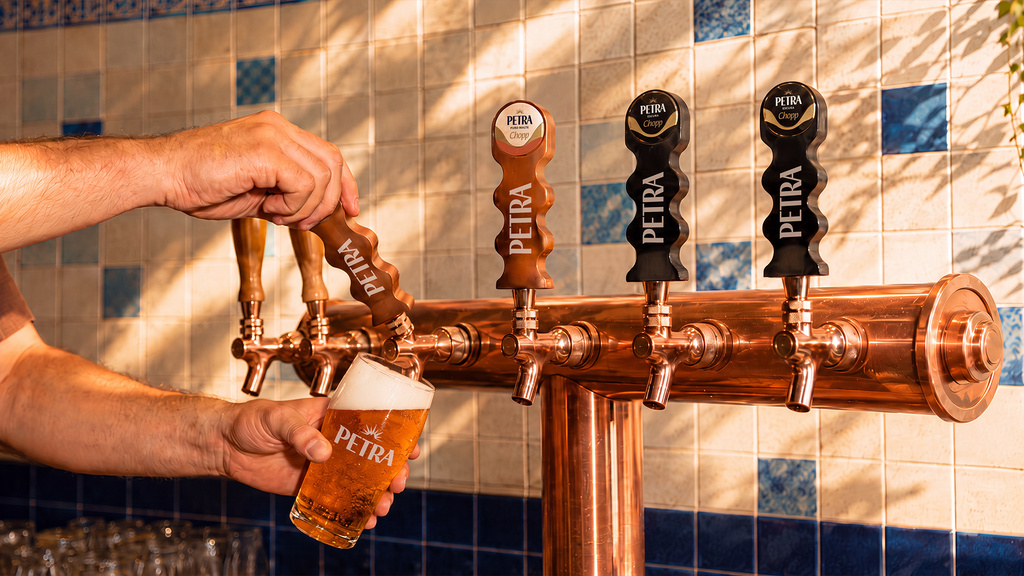
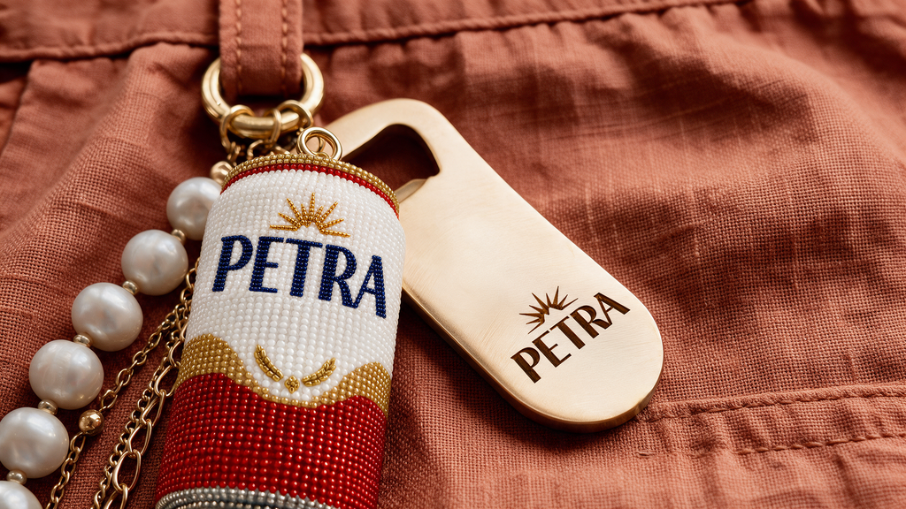
At the point of sale, this vision translates into a new range of trade products, incorporating materials, finishes, and pieces with a more premium and sensory character, elevating the brand's presence and creating greater differentiation in consumer spaces. The system extends to lifestyle, incorporating uniforms, clothing, and accessories as part of Petra's expression, taking its codes beyond physical spaces and reinforcing its presence in different contexts.