STRATEGY
The project was structured in sprints that covered diagnosis, branding platform, creative platform, and ideal journey—exploring internal, external, and market perspectives before any construction. The learnings from the diagnosis were crucial: it became evident that Panobianco's greatest untapped asset was enjoyment as the driving force behind exercise, in a market that still communicated training as an obligation and discipline. The tension was clear—and with it, the space for differentiation.
From there, the strategy was designed to move the brand from standard market behavior to a proprietary and recognizable position, organized around the "Is, Does, and Says" method. voltage ”"exercise treated as just another obligation of the routine," purpose — Sharing the desire to exercise — was designed as an active call to action, evoking the sensory experience of exercising with enthusiasm and engaging both those who already train and those who haven't yet found their way to move.
O Lover archetype He was chosen to embody this passionate relationship between brand, student, and training — and it sustains a personality with four complementary facets: captivating (which transforms the environment into something enjoyable), professional (which conducts with knowledge and responsibility), passionate (which is dedicated to every detail) and invigorating (which welcomes and rekindles energy).
A value proposition It was organized into four territories — enjoyment in exercise, flowing training, sustainable strength, and active connection — balancing the student experience, the digital offering, and the business model for franchisees.
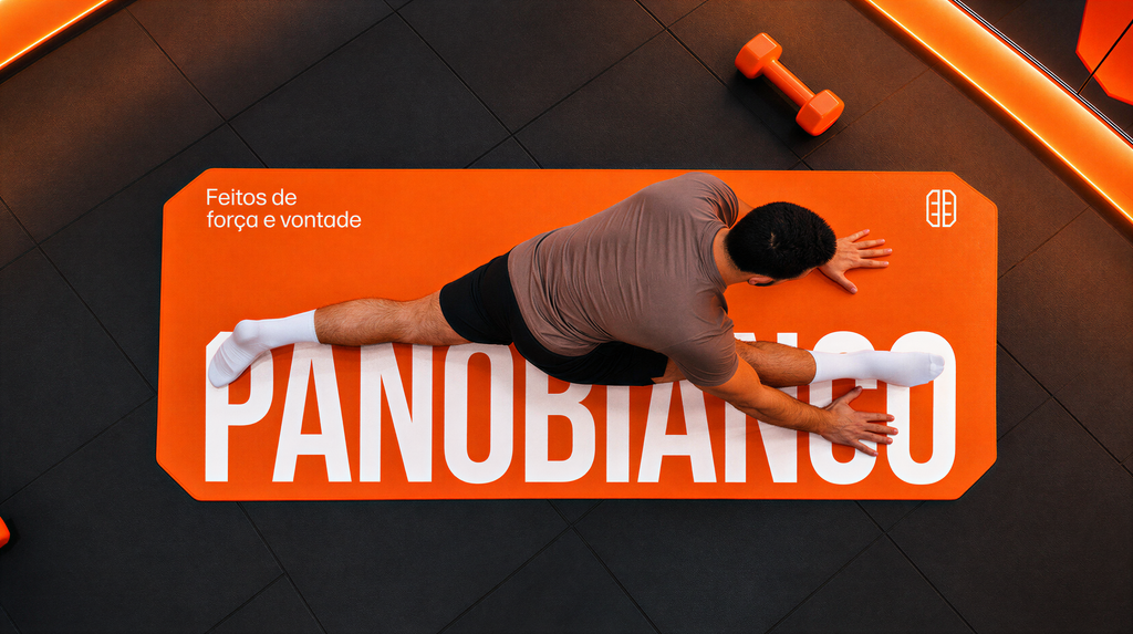
A narrative The brand gives voice to this personality in the first person, with intimacy and lightness, culminating in... tagline Made of strength and willpower. — playing with the expression "willpower" to bring together the two pillars that Panobianco wants to awaken and spread: physical strength and the desire to exercise.
CREATION
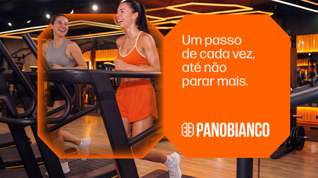
The Creative Platform is guided by the purpose of sharing the desire to exercise and is structured around four creative expressions. Focus on Detail It reveals the sweat, concentration, and dedication present in each training session. Pace of Evolution It reflects the consistency and repetition that drive progress. Force and Vibration It manifests itself in vibrant visual elements and the energy of Panobianco orange. Invitation to Training It reinforces an academy open to all, valuing the diversity of bodies, ages, and goals.
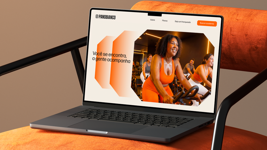
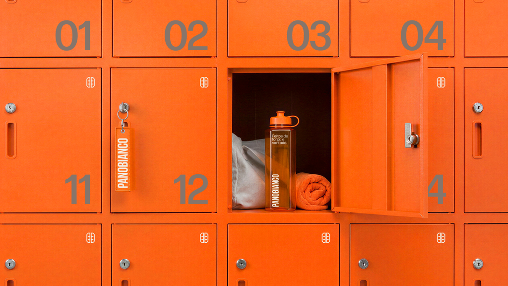
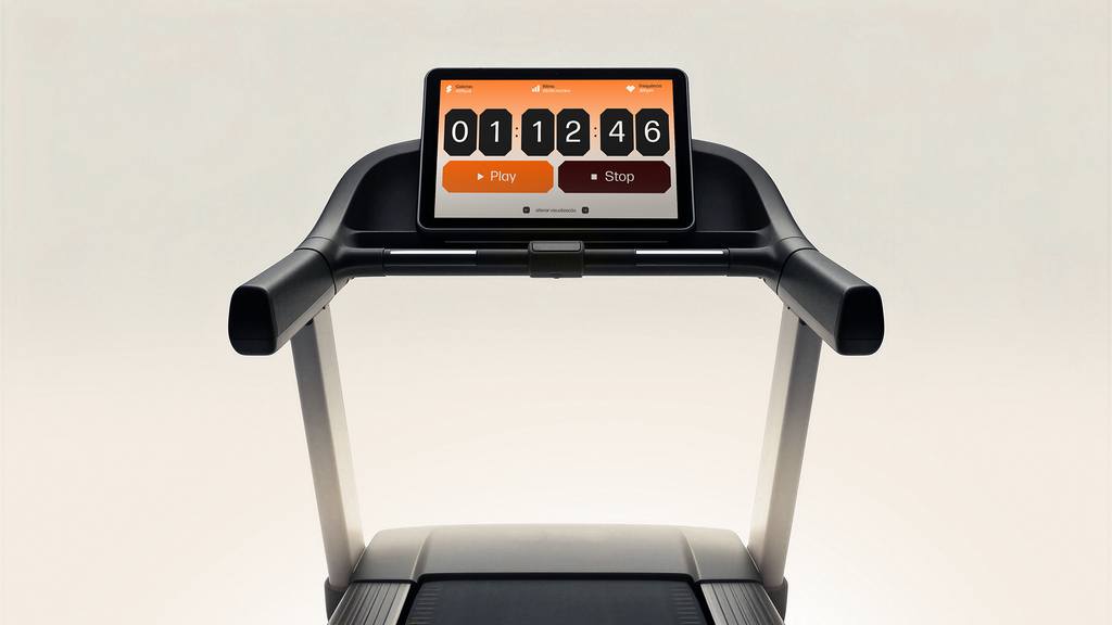
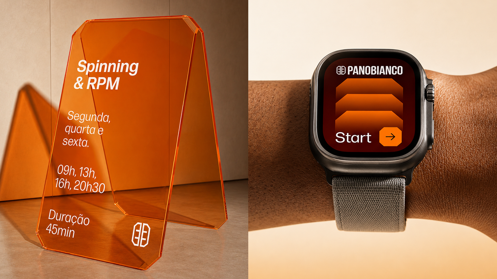
The brand is preserved and gains a visual system built from its symbol. The segmented corners expand to create graphics, icons, and compositional structures that ensure recognition and consistency across all touchpoints.
Orange, the brand's main asset, remains the protagonist, representing energy, vitality, and movement. A complementary palette expands the possibilities of expression and adds more dynamism to the communication.
The photograph portrays exercise as a source of well-being, satisfaction, and personal fulfillment. Real people, with different profiles and diverse goals, help build a more welcoming and inspiring brand.
The result is a more approachable, vibrant, and contemporary brand, capable of inspiring movement and a sense of belonging. An identity that strengthens Panobianco as an academy for everyone who believes that evolving is a combination of strength and willpower.
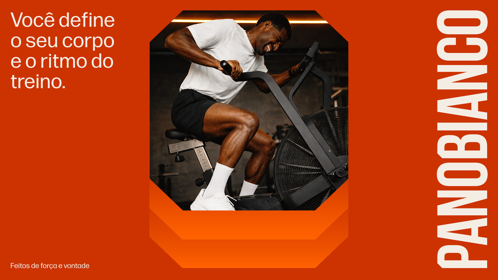
In his verbal communication, Panobianco's love for exercise translates into a strong desire to talk about this passion. Combining lightheartedness, motivation, and precision with the right weight, his communication mixes gym jargon with popular expressions, creating a style that encourages and fosters identification and connection. This can be seen in titles such as "burn off laziness in your warm-up," "you define your body and the rhythm of your workout," "the best series to binge-watch is your own," and "to lift the bar and like yourself."