STRATEGY
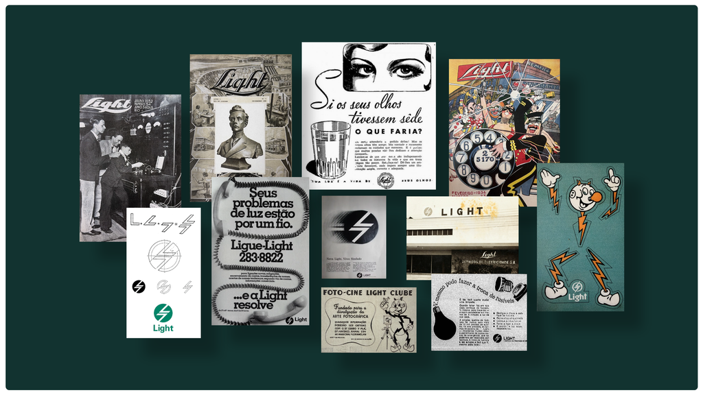
To ensure consistency across all its business initiatives, we sought to restore and preserve the brand's credibility, moving away from the perception of an "old" company and updating its genetic code for the coming years.
This movement is materializing from three integrated fronts.
In terms of brand identity, Light adopts a more proactive, firm, and present stance, reinforcing its leadership and close relationships with people, clients, and partners.
In business, it broadens the understanding of its role as a structuring agent of development, connecting innovation, technology, and security to support the transformation of cities and society.
In its portfolio, the company organizes and strengthens a comprehensive energy operation — from generation to commercialization — prepared to respond to the new demands of the market, technology, and people's daily lives.
“Ready and Energized” was created to make the branding platform's strategy tangible and to translate the reputation of a company prepared for the challenges of an increasingly fast-paced and connected world.
The narrative firmly emphasizes Light's preparedness to keep pace with the new technological revolutions that are to come, alongside other people. He demonstrates presence and agility in communicating with diverse audiences.
CREATION
The creative platform was designed to express a Light that is always present, lit, and in motion.
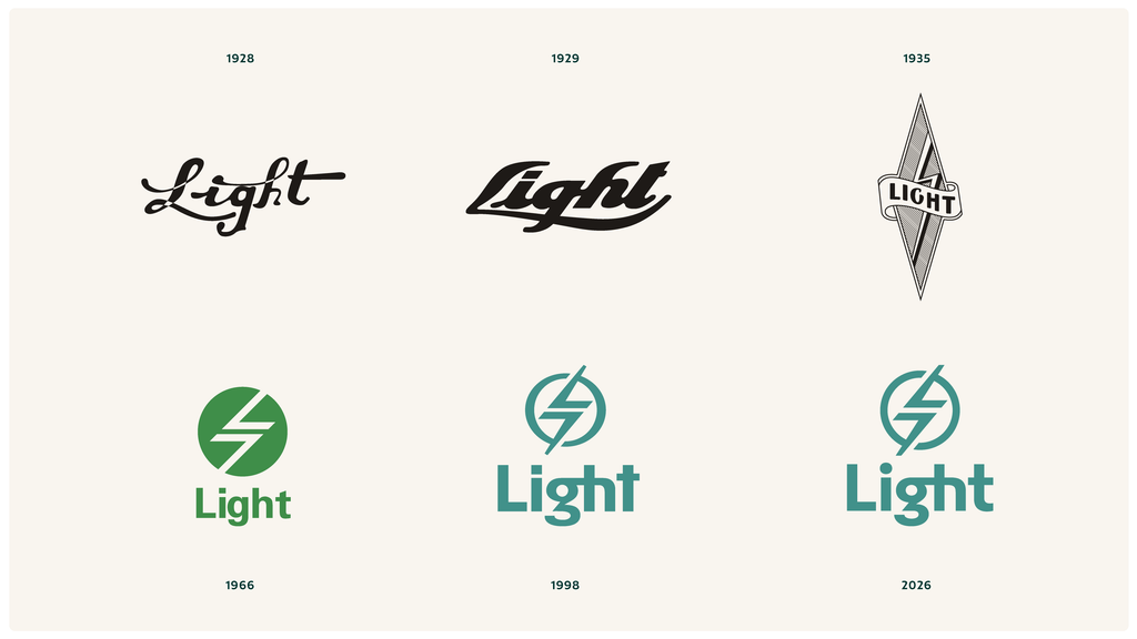
Originally designed in 1966 by Aloísio Magalhães, an icon of Brazilian design, and redesigned by Evelyn Grumach In 1998, the brand underwent a careful overhaul to enhance its performance. The typographical refinement brought a more human and approachable expression, while the adoption of a single, monolithic brand simplifies business management and strengthens its value proposition across all sub-brands.
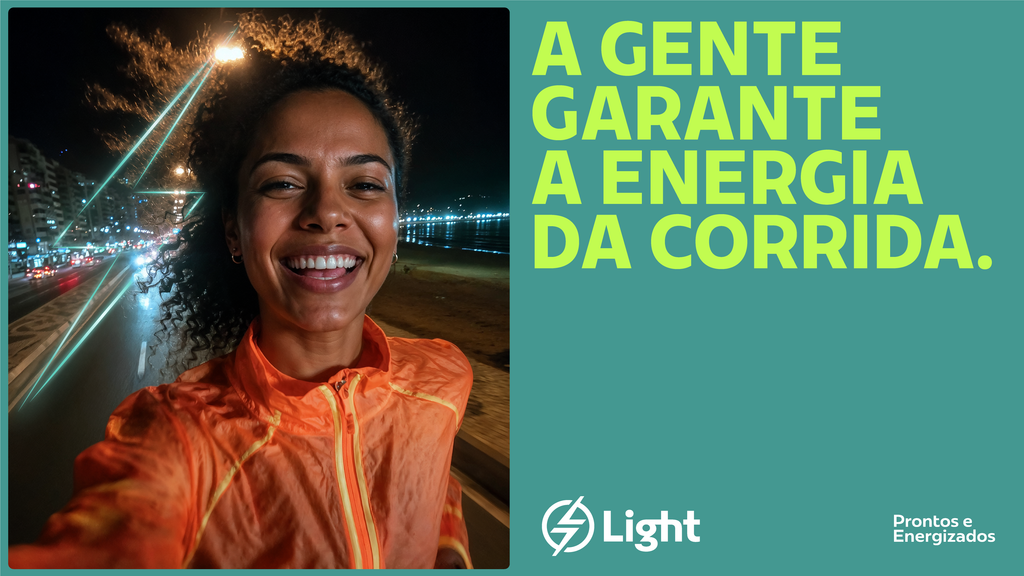
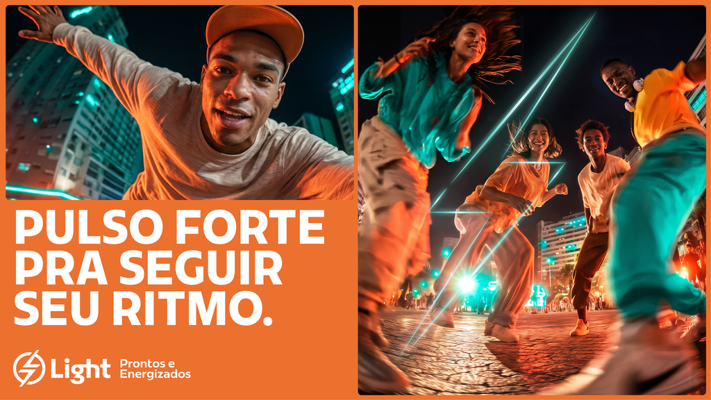
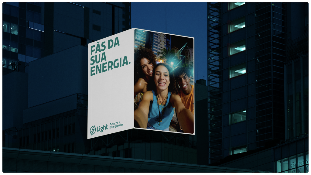
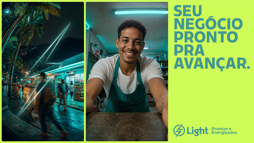
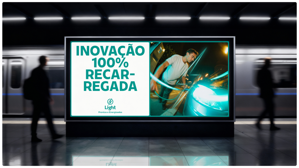
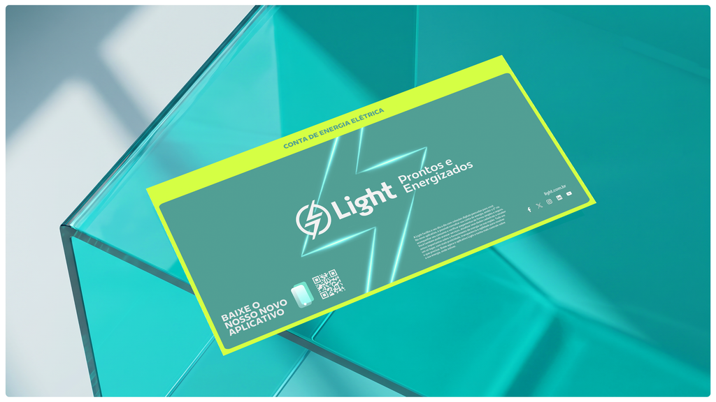
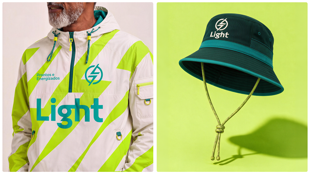
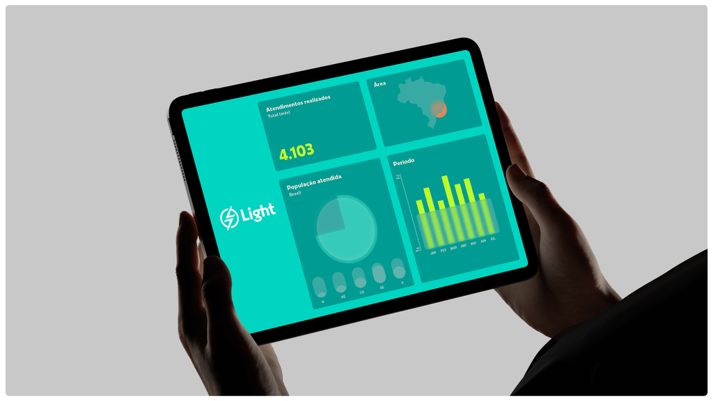
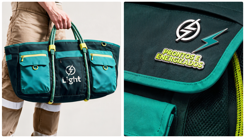
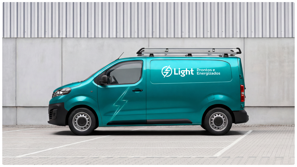
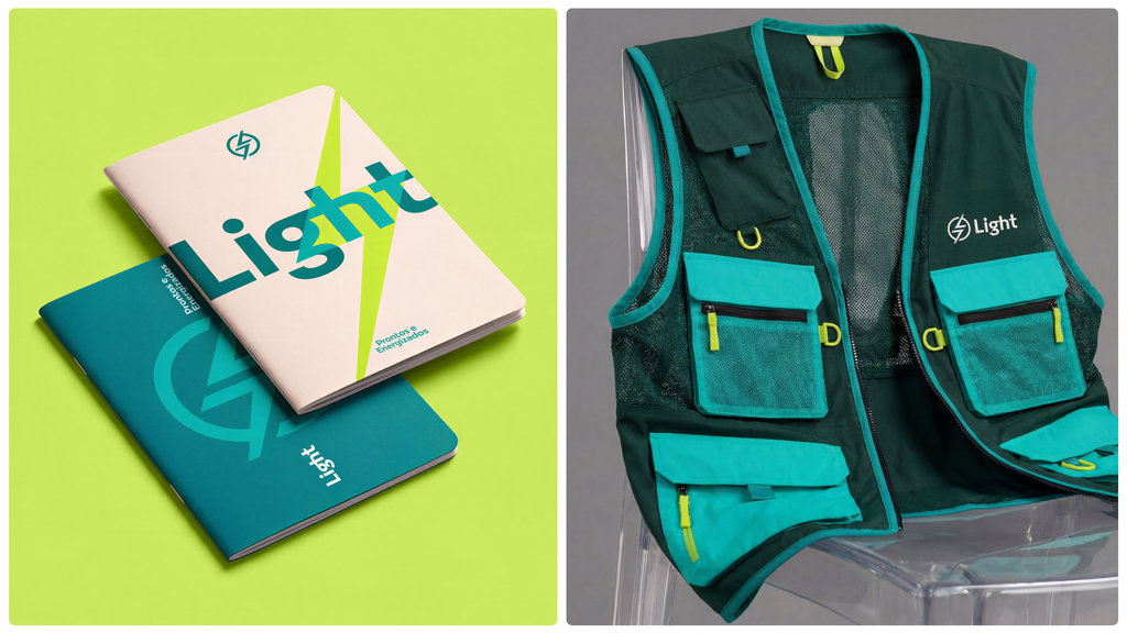
Connected to different lifestyles and the daily life of cities, the new visual language starts with Light's already recognized green and expands its palette with new shades of green and orange, bringing more energy and versatility to applications. The typography of the titles gains impact and strength, reinforcing the brand's readiness and presence.
The lightning bolt, derived from the logo, takes center stage and expands throughout the design language, interacting with dynamic photography that connects people, environments, and stories. The brand connects with its audiences by revealing the collaborators behind the service, its presence in people's daily lives (B2C), and its partnerships with companies of different sizes (B2B). In all images, the Light green color appears vibrant and present, reinforcing the brand's energy.
To reconnect Light with people and inspire them with courage, the brand's voice is anchored in three maxims: Reflecting confidence, positive energy, and readiness to move forward.
These Voice Tones renew the Light way of speaking, incorporating expressions connected to new habits and translating a light, approachable, collective spirit, conscious of its citizenship. Thus, the brand expands its authority in conversations with different audiences, transforming relationships and illuminating the innovations of the 21st century.
EXPERIENCE
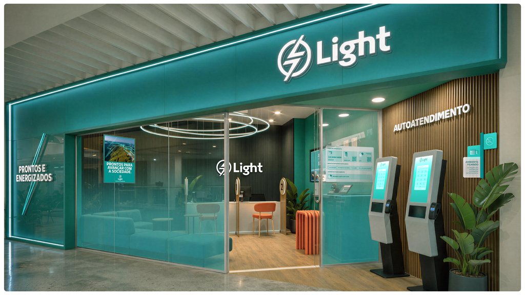
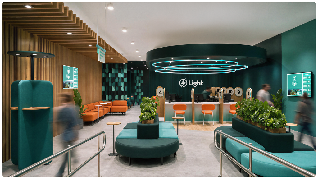
Light's transformation also takes on a physical dimension, stemming from a new vision for the in-store experience. The spaces now act as an extension of the brand, creating moments capable of attracting, impacting, and welcoming different audiences throughout their journey.
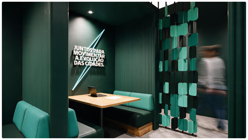
The proposal aims to broaden the perception of the store beyond its functional and service-oriented character, transforming it into a space for connection with the brand. A more human, welcoming, and intuitive experience that fosters customer autonomy and seeks to enhance the feeling of privacy, comfort, and trust in various interactions.
The concept translates into a vibrant, dynamic, and ready atmosphere, exploring transparencies, light, movement, and visual elements that make Light's presence recognizable in the space. A flexible language, capable of adapting to different formats and levels of implementation, while maintaining consistency in experience and brand.
More than defining a single store configuration, the project establishes principles capable of guiding different spaces and contexts, bringing the new Light concept to the physical environment in a consistent, accessible, and contemporary way.
COMMUNICATION
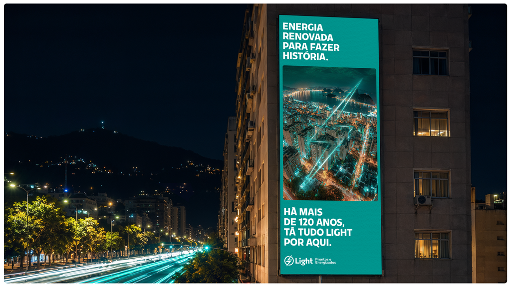
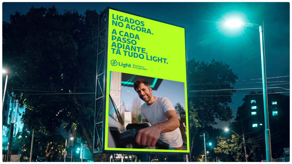
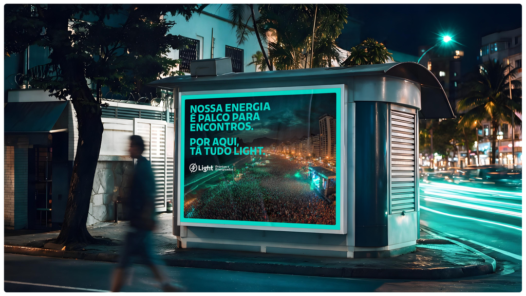
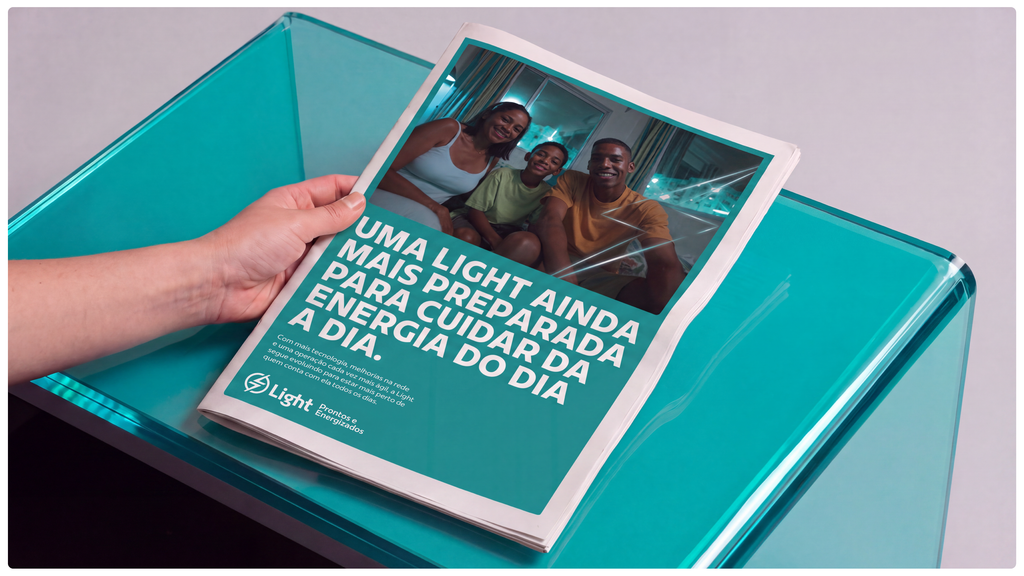
To present Light's new phase, we created a campaign that uses the brand's name itself to take over the streets and people's conversations: Everything's light.
An everyday, popular, and positive expression that reflects a more modern Light, better prepared to continue being a part of life in Rio.
In the film, this idea appears in different scenes and routines, linking distinct situations connected by the presence of Light and the energy that keeps the city moving.
The campaign also gained an original jingle, with a catchy rhythm and inspiration from the culture of Rio de Janeiro, bringing the concept to music and reinforcing its connection with the public.
With film, jingle, radio, OOH and digital, Tá Tudo Light presents the brand's new phase with more contemporary and recognizable communication, designed to bring Light closer to those who renew this story every day.