STRATEGY
Through a series of internal interviews, market research, and an immersion in the cultural context of male beauty, we arrived at the tension surrounding the stigma of being vain, where male self-care is still seen as a weakness. To address this, the purpose "Free to take care of (yourself)" guides what reyou is, does, and says. A holistic care brand that offers men's cosmetics with intelligent technology and dermatologically tested efficacy, combining practicality for everyday life with sustainable, biodegradable, and cruelty-free formulas. It values individual and collective well-being, encouraging new self-care habits with freedom and authenticity.
CREATIVE PLATFORM
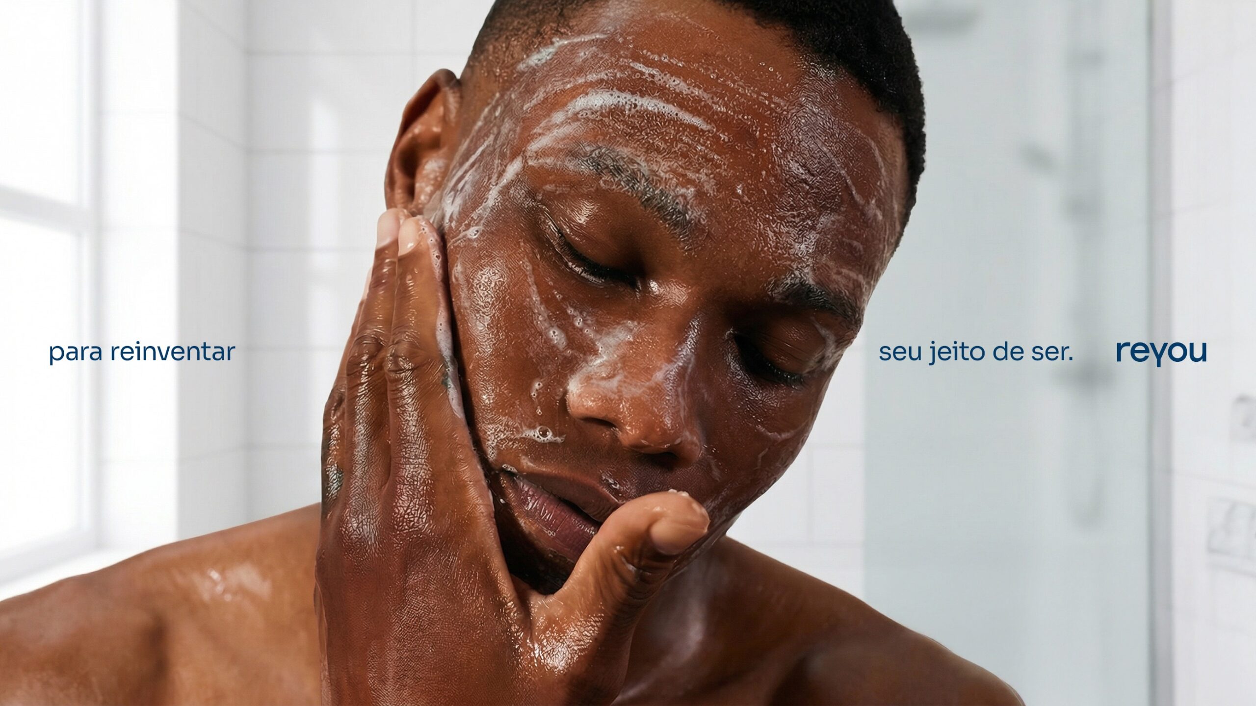
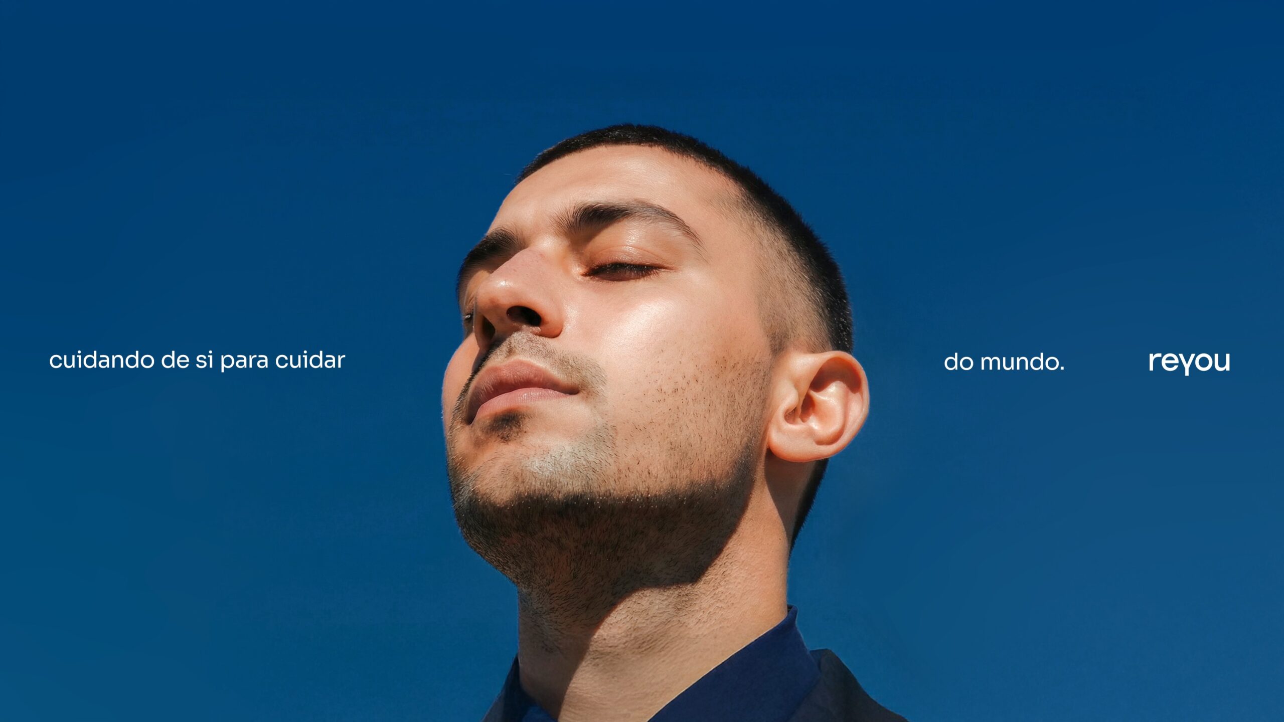
The creative construction of reyou was born with the intention of provoking reflection in the male universe. With a tagline that says "Caring is reinventing yourself," we invite reinvention. The creative expressions resonate in the concepts: Holistic Care, Reflection and Self-Care, Comfortable Functionality, Sensory Atmosphere.
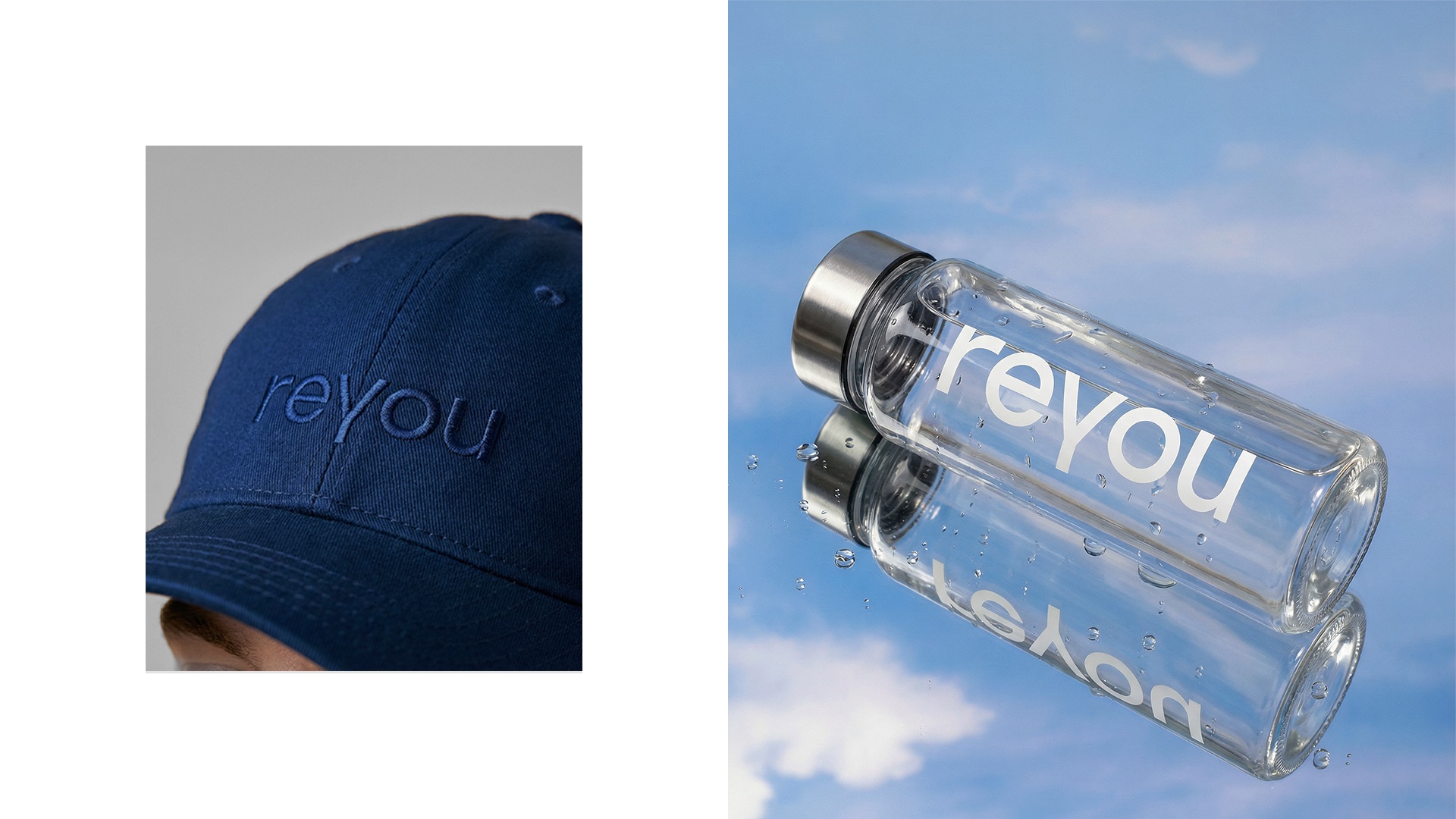
The brand design stems from the idea of comfort as form, with a symmetrical construction where the letters fit together perfectly and organize the "Y" of reyou at the center of the identity, reinforcing self-care as a structuring principle. From this gesture, a design system based on an editorial grid was developed, which enhances empty spaces as an element of clarity, sophistication, and visual hierarchy. The photography creates a sensory and contemporary atmosphere, connected to daily life, comfort, and naturalness, while the sky-inspired shades of blue permeate the entire language and integrate with the Sora typography, which means "sky" in Japanese.
The tone of voice was created to symbolize a brand that inspires care, questions with courage, and that the public can trust. Our message is sensitive and clear to all audiences and individuals. We emphasize the practicality of breaking free from standards and confidently affirm our way of being and the rational and emotional benefits of our products.
PACKAGING
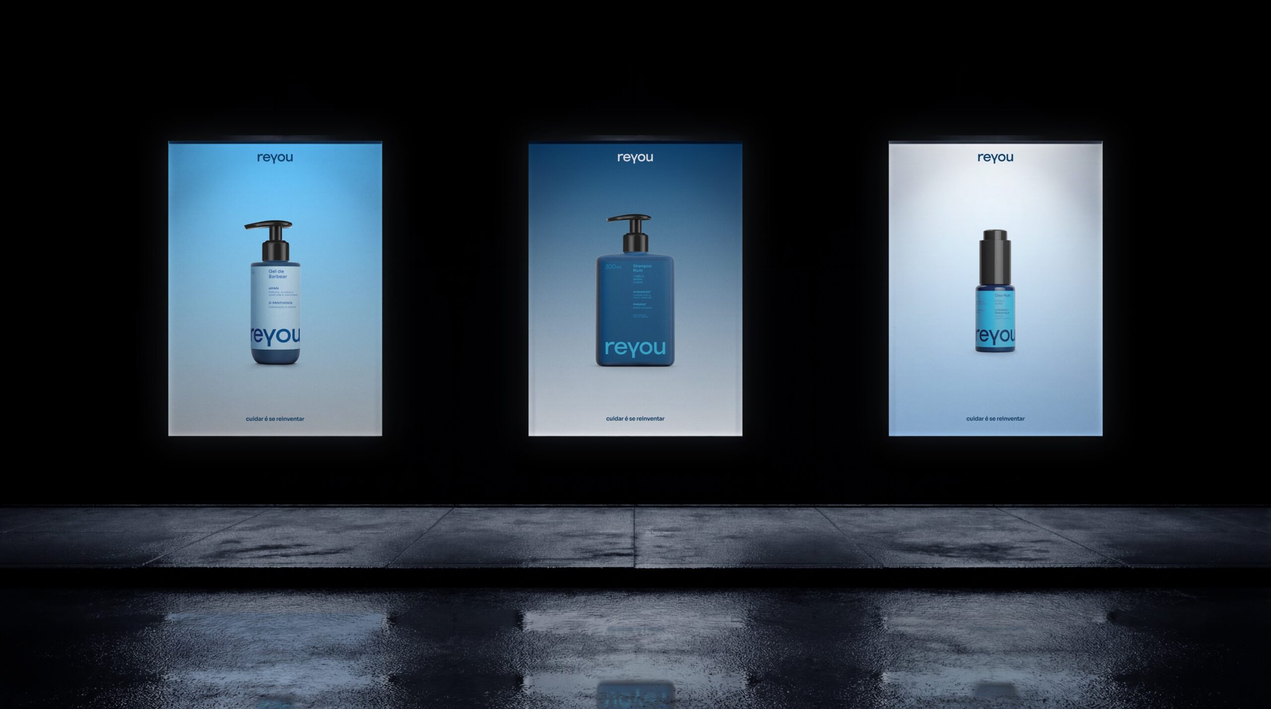
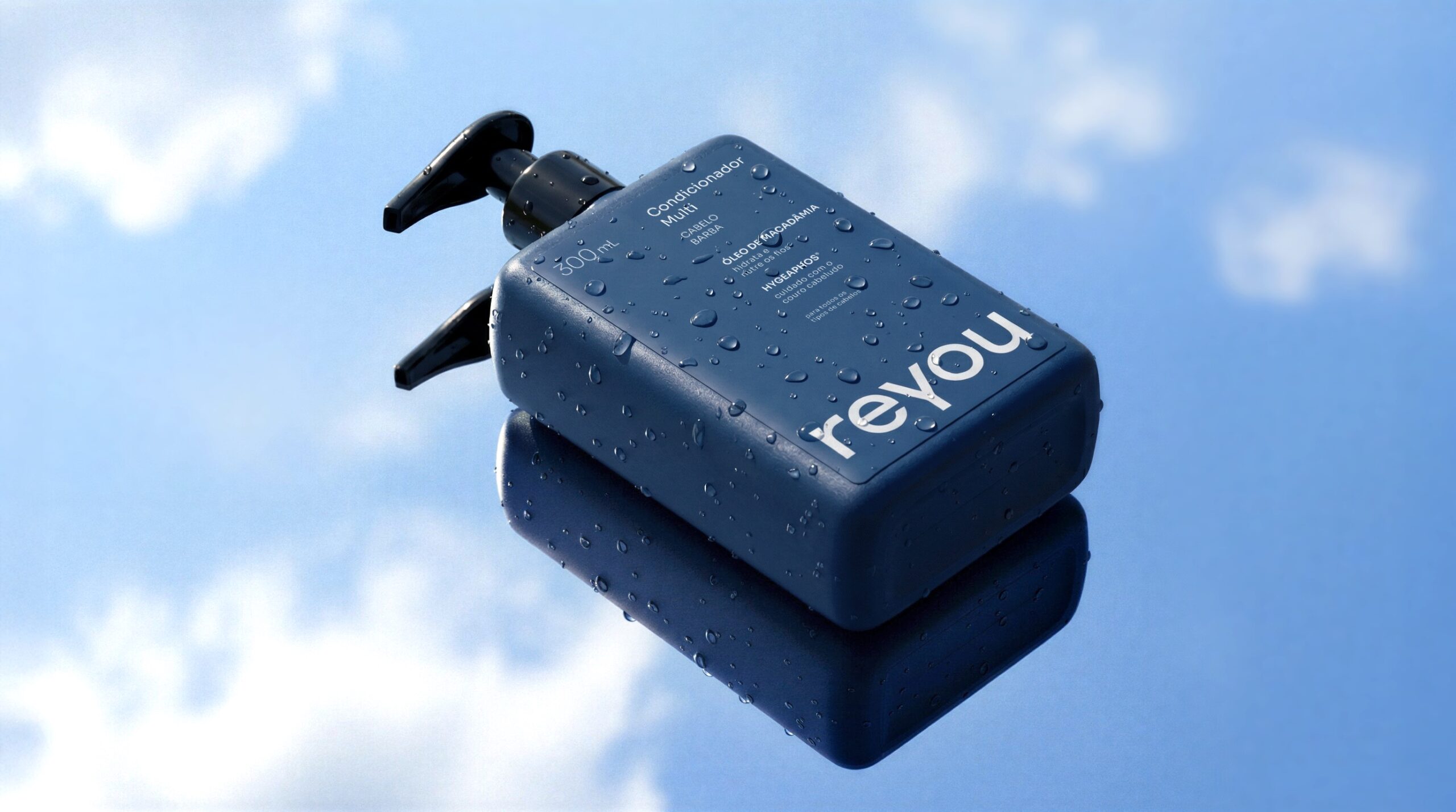
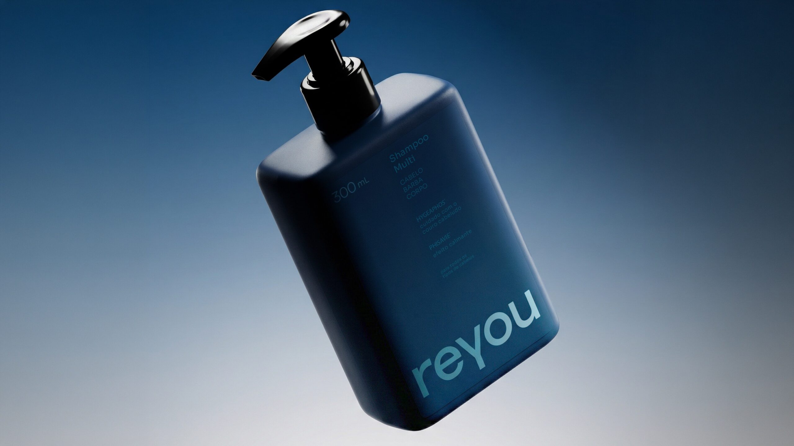
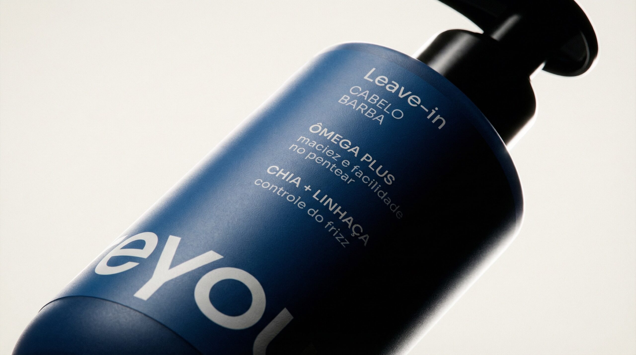
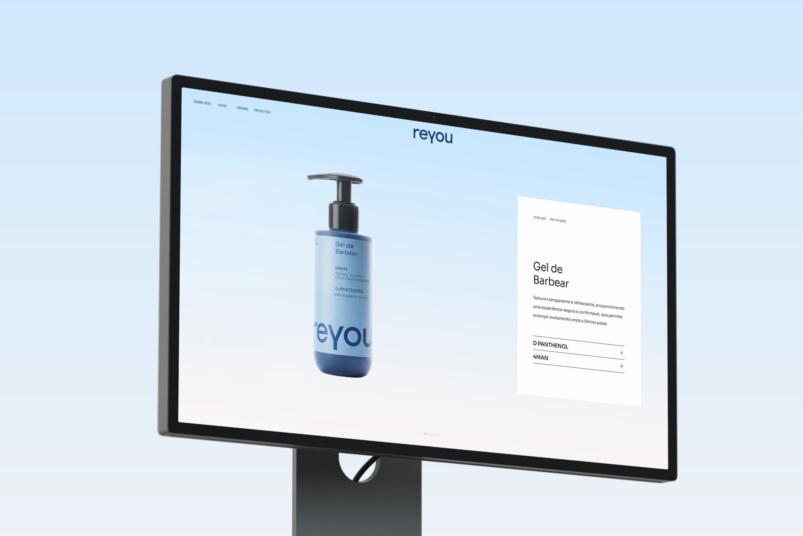
The packaging is a direct extension of Reyou's purpose and translates, visually and functionally, the freedom, practicality, and confidence that the brand proposes for men's self-care, breaking with aesthetic excesses and traditional codes that distance men from the care ritual. Designed to facilitate the experience, it presents objective and easy-to-read information, prioritizing the essentials for quick decision-making at the point of sale and for everyday use.
The colors were chosen to represent the different stages and functions of the daily routine, making care more intuitive and organized. The intentional reduction of graphic information, in addition to guiding understanding, creates visual impact, facilitates brand identification from a distance, and guides the eye at the point of sale. The visual elements cease to be merely aesthetic and begin to fulfill a functional role: capturing attention, guiding, differentiating, and simplifying the choice. Practicality permeates the entire packaging design, with ergonomic bottles that are comfortable for daily use and handling solutions that facilitate application, quantity control, and quick use. This logic reinforces Reyou's positioning as a brand that understands the real daily life of men and offers intelligent solutions, without complex rituals or barriers to use.