STRATEGY
Tirolez's transformation journey began with an extensive diagnostic, including technical visits to the factories, in-depth interviews with executives and consumers, focus groups, quantitative research, and a detailed market analysis.
While the category relied exclusively on tradition, quality, and flavor, we discovered something very powerful at Tirolez: people proud to be part of a company that goes beyond being just a cheese factory. Tirolez cultivates a culture that inspires more than just production, but also constant learning. With an innovative DNA, the company has also stood out by creating categories such as light cheeses and products like ricotta and Minas cheese creams, and more recently, mozzarella sticks.
The passion of the people at Tirolez for discovering and learning about cheese is evident. Cheese, more than a product, is a link that connects people, gives life to rituals, and makes everything more flavorful. Thus, Tirolez has adopted as its purpose the statement that "it's delicious to nourish the best in ourselves."
Based on this purpose, we have built a passionate, inventive, dedicated, and encouraging personality. And an experience that aims to bring cheese to all tastes and occasions, enhances routines and rituals, and builds the journey of cheesemaking. This journey is like a school of knowledge and flavors, encouraging people to discover and savor new experiences that awaken the best in everyone.
The entire strategy is summarized in the tagline "better with each cheese." This phrase inspires personal improvement, speaks to customer loyalty by showcasing the diversity and breadth of the portfolio, reinforces the idea of growth through new experiences, and strengthens the credibility and quality of Tirolez, from internal processes to the consumer experience journey.

MARK
The brand design was refined to eliminate noise and excessive graphic effects present in the brand's characteristic yellow stripe, giving it greater iconicity and visual clarity, optimizing readability and ensuring more powerful applications.
For the logo, a new typeface was designed with a more striking and unique personality, without losing the recognition of the original brand.
Through meticulous collaboration with the illustration studio Mascoteria, we updated the mascot's design, moving from a two-dimensional illustration to a more modern and mature three-dimensional finish, while maintaining the character's natural charisma.


VISUAL UNIVERSE
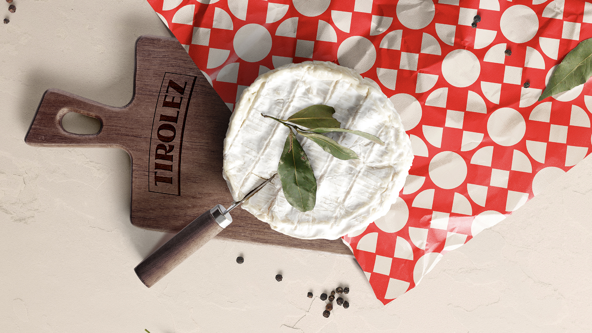
We based our designs on the geometric shapes of the cheeses to create graphic patterns inspired by typical Tyrolean ornaments.
The arc present in the brand's logo gives rise to a versatile Master Shape that enhances the brand's applications on packaging. The main colors, red, yellow, and blue, are maintained and gain a vibrant and functional complementary palette, helping to organize the brand's vast product portfolio.
The typography of the universe was designed to reflect the energy and knowledge of the brand's archetype, the sage, balancing sophistication and modernity. The photography explores the sensory aspects of cheeses to create a visual that invites experimentation.
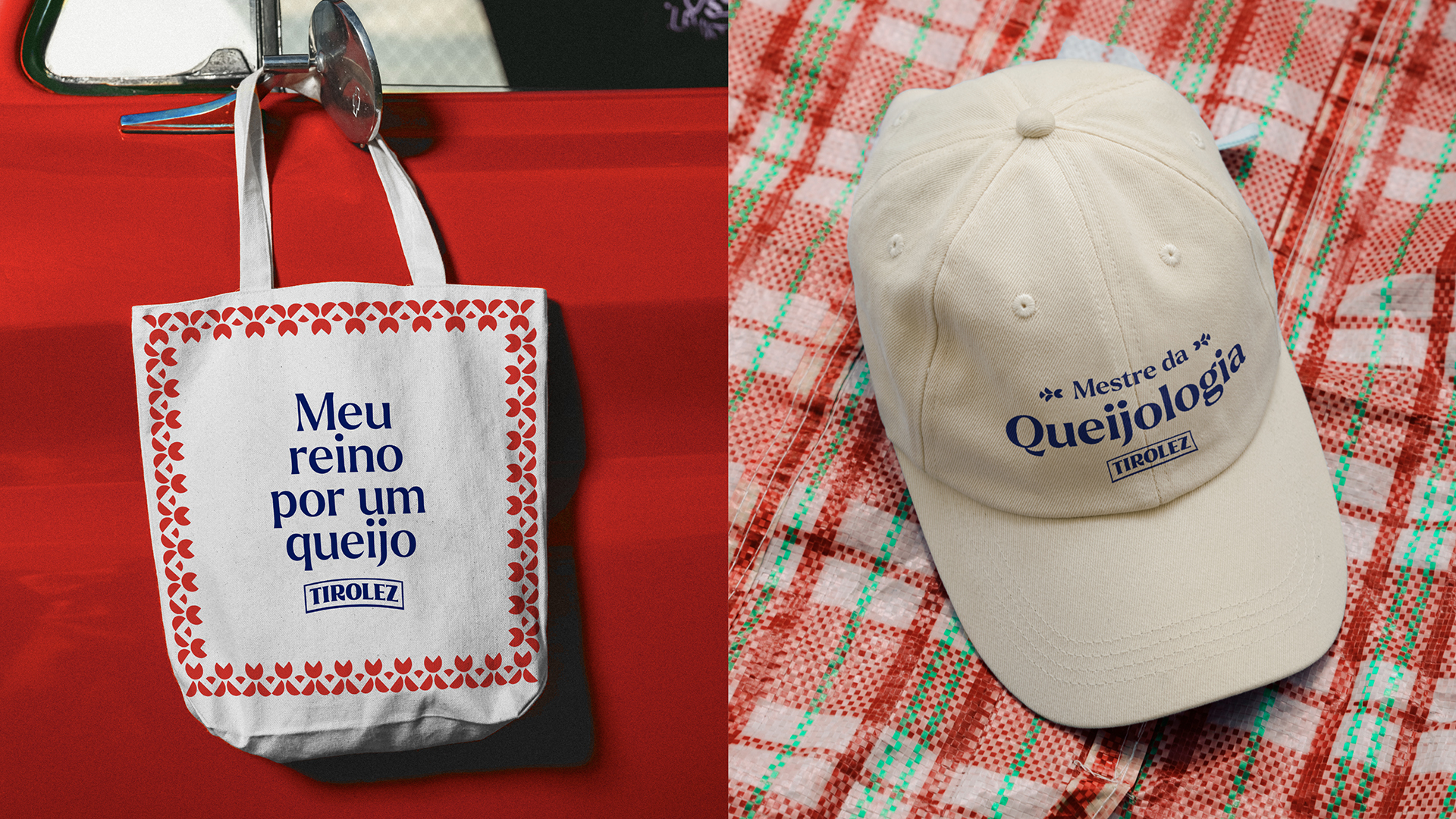
VERBAL UNIVERSE
The brand's voice expresses all our passion and expertise in our products. When it comes to cheese, we are true poets of everyday life. We inspire people to connect with the most diverse flavors, highlighting details and encouraging the exploration of the senses through mouthwatering metaphors.
Combining creativity and practice to showcase everyday habits and rituals we've learned with the audience.