STRATEGY
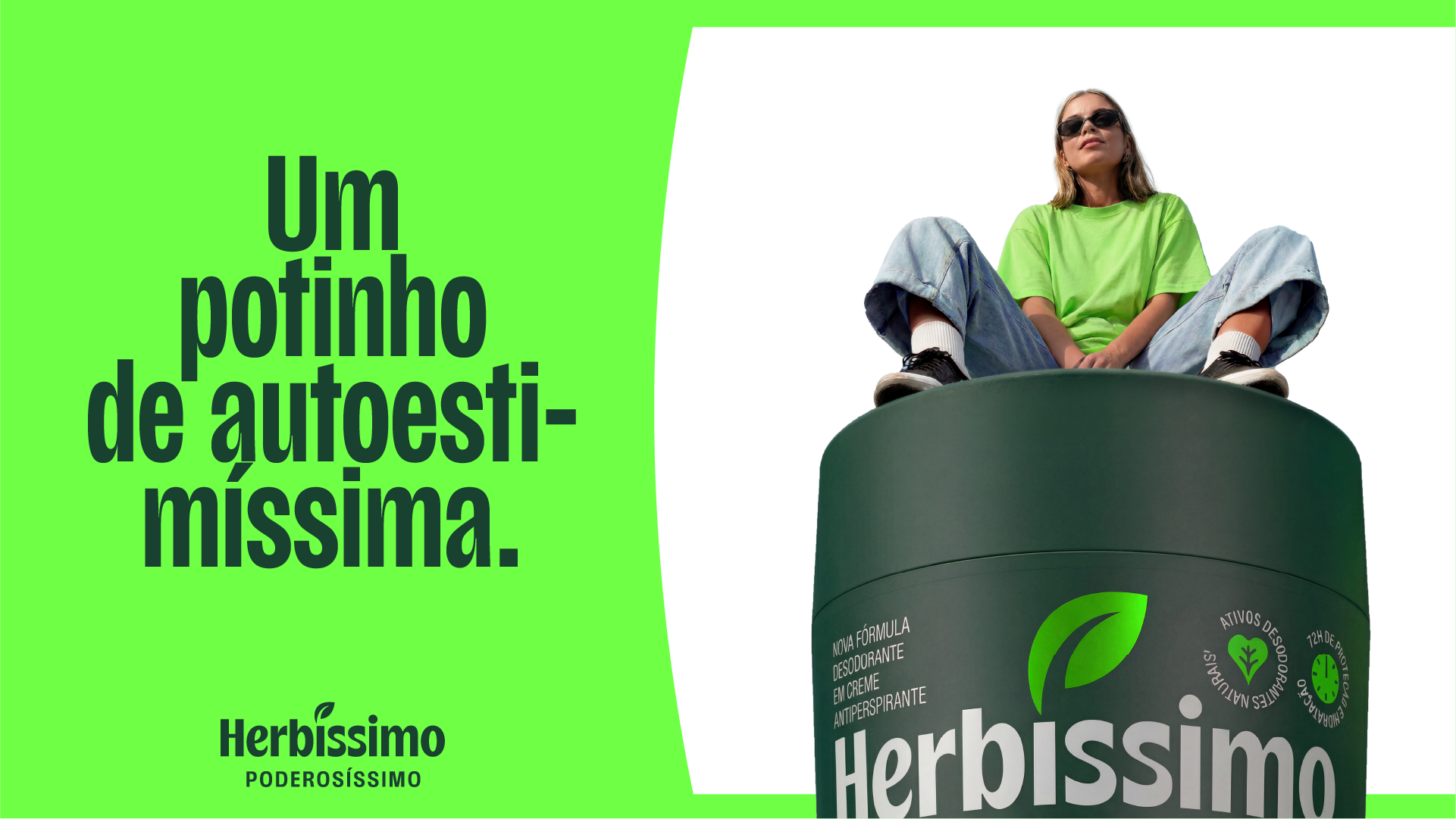
Herbíssimo's rebranding strategy was built to expand the brand's role in the market and in people's lives. Instead of remaining restricted to the realm of cream deodorant, Herbíssimo is now positioning itself as a personal care brand for the whole body, combining natural ingredients, high performance, accessibility, and self-esteem – yes, in the superlative.
Anchored in the purpose "Self-esteem that happens in the body," the brand redefines self-care as a simple, effective, and enjoyable experience. More than just talking about self-esteem in a generic way, Herbíssimo advocates for a more confident and fun self-esteem, consistent with its own name.
With an irreverent, beloved, reliable, and self-assured personality, the brand gains a clear and proprietary positioning, capable of supporting a broader portfolio and increasing its competitiveness against the major players in the sector.
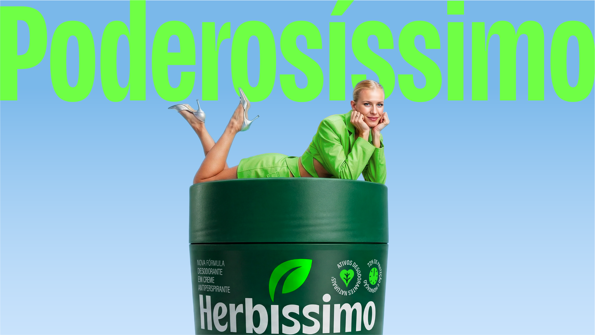
The result is a clearer, more charismatic brand, ready to scale: moving from a category icon to establishing itself as a cosmetics brand with its own unique language. This vision is reinforced by the new tagline "Herbíssimo. Poderosíssimo." (Herbíssimo. Super powerful.), which expresses both the power of the products and the feeling the brand delivers to people: more confidence, more presence, more boldness to take care of themselves and show themselves to the world.
CREATION
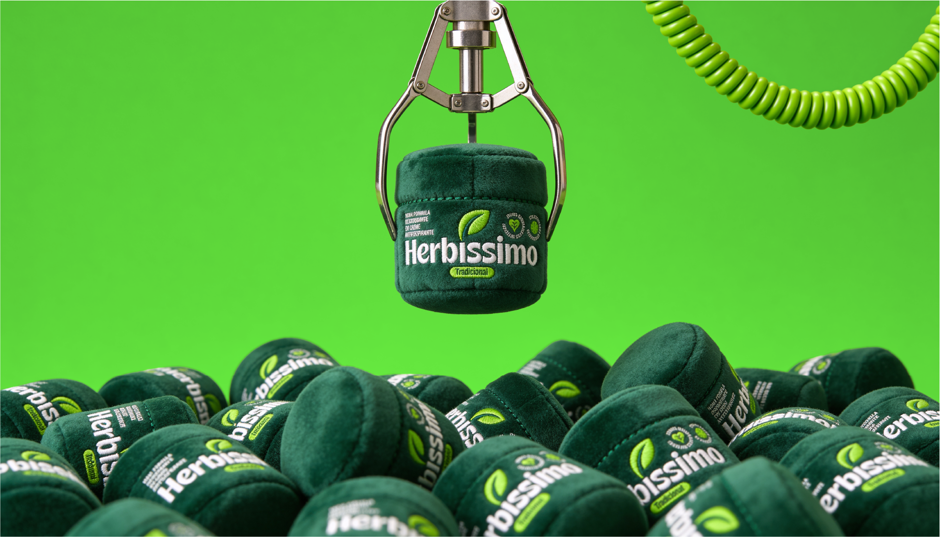
The Herbíssimo brand has been refined to gain modernity and performance, highlighting the irreverent touch in its design. The original leaf remains as a symbol, ensuring recognition and reinforcing its very natural appeal.
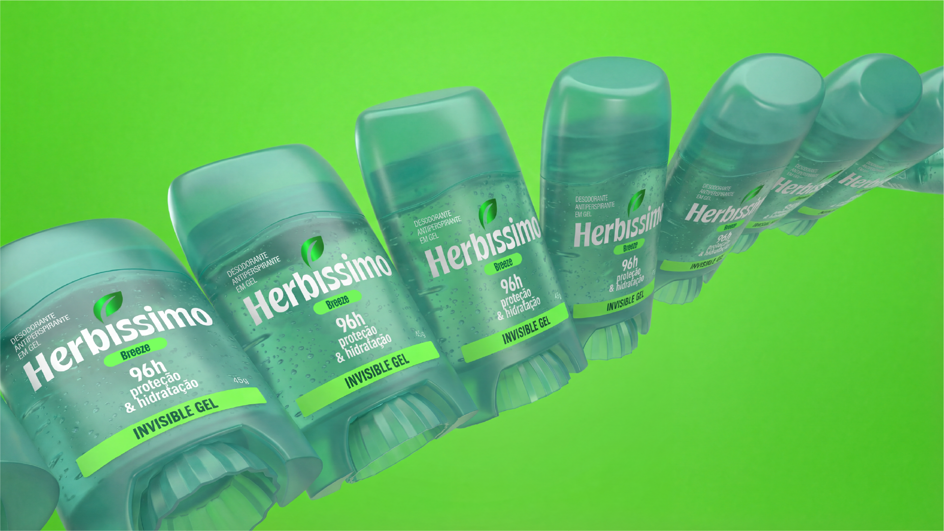
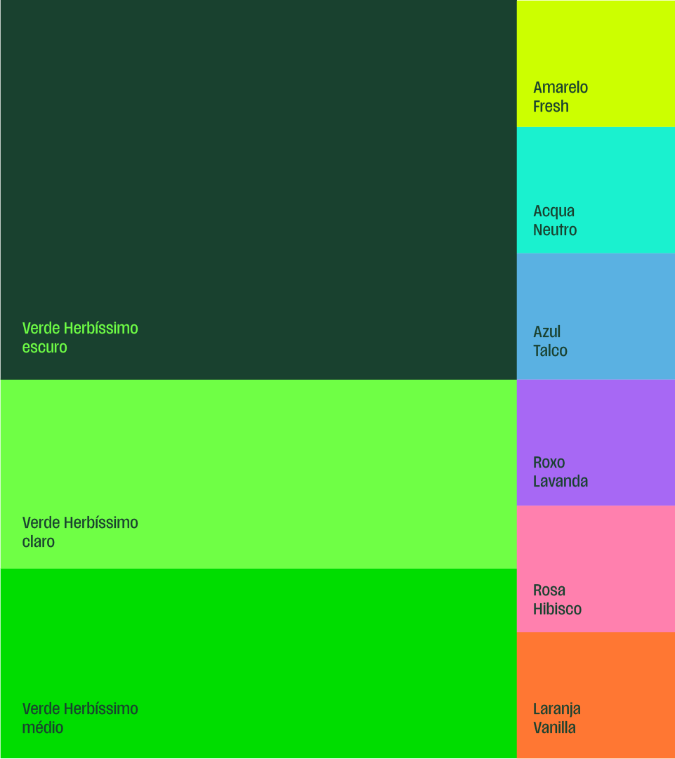
The color green was also retained and enhanced, taking center stage in new and vibrant shades, complementing a cheerful and versatile palette capable of covering the entire product family.
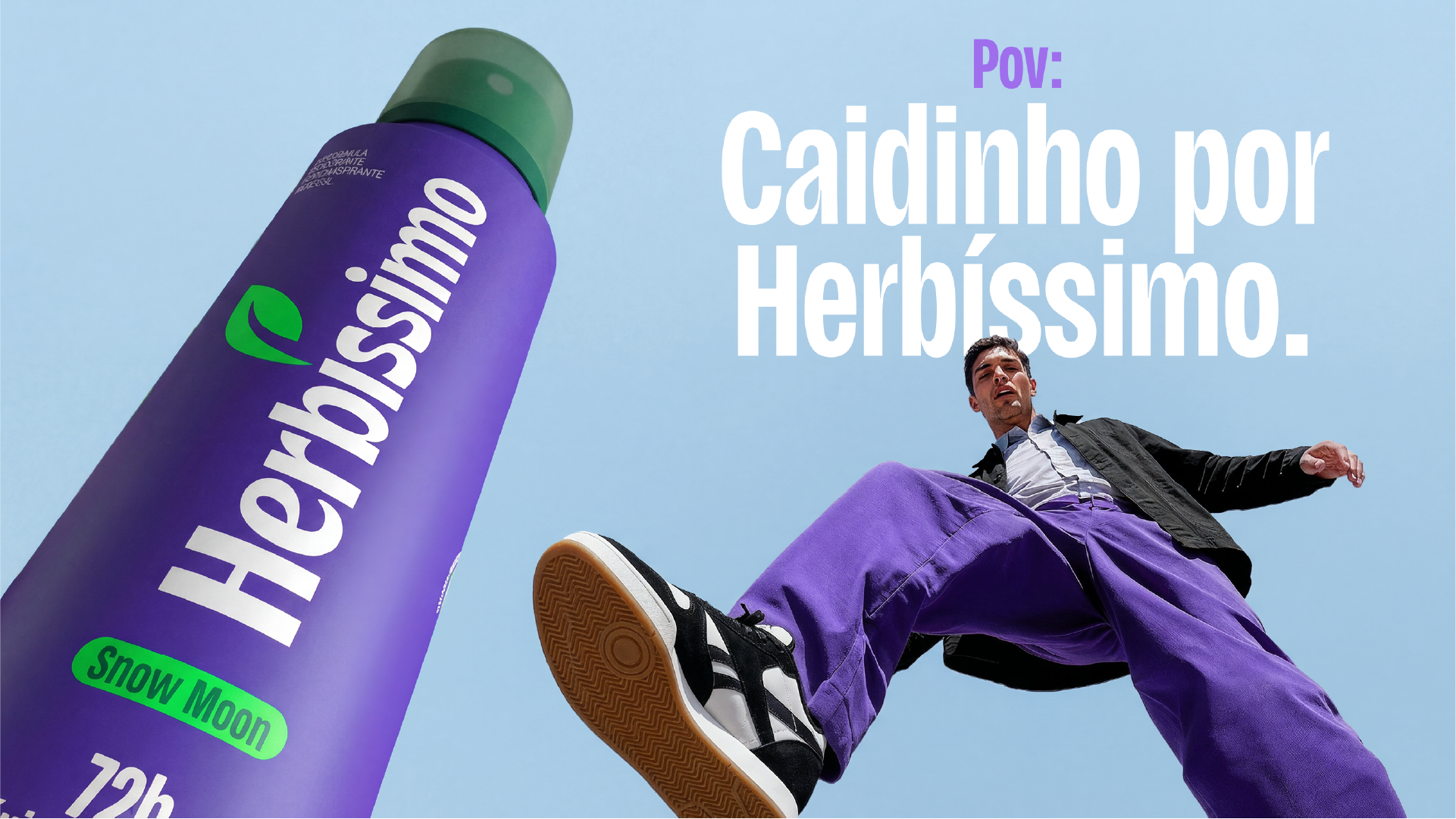
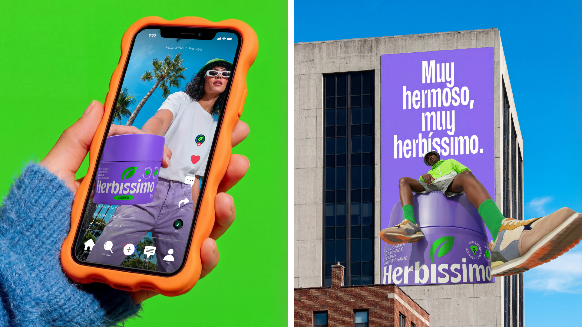
The brand's creative expressions take the superlative as their premise, featuring unusual angles, bodies with attitude, and powerful products that reflect Herbíssimo's good-humored self-esteem.
With strong and impactful typography, the brand conveys a self-assured personality, while the iconography helps communicate the benefits of a trustworthy and beloved brand.
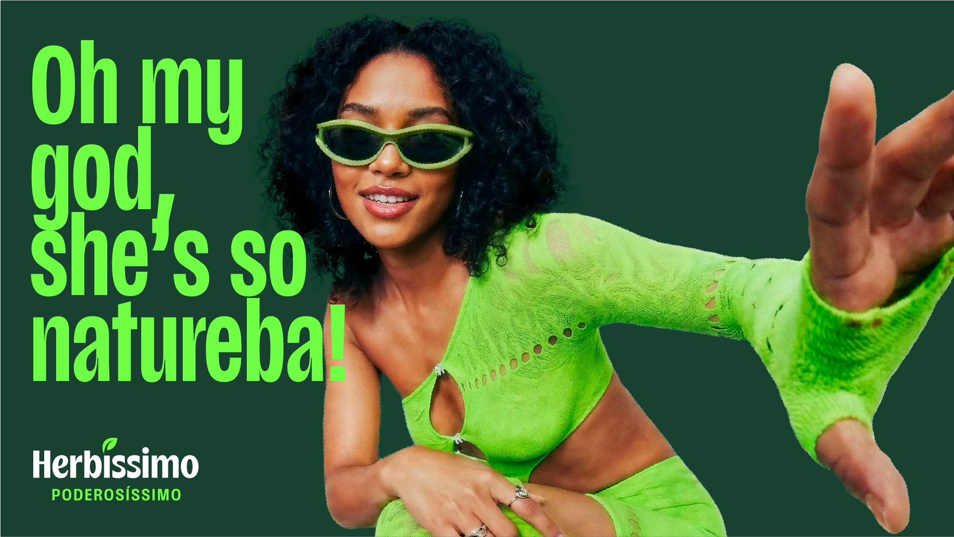
Herbíssimo's voice needed to convey all the energy and relaxed nature of his personality. His vocal tones balance humor, glamour, and credibility, with an unusual way of boosting and appreciating people's self-esteem.
In the tone titled as “Debauched”, Her speech is funny and her vocabulary is uninhibited, without losing class, playfully addressing the act of applying deodorant without overdoing it. In a different tone, with a more creative and unusual intention, she makes provocative remarks that shake things up, exploring various languages, neologisms, and superlative phrases. Finally, to instill confidence in the quality of her products and boost self-esteem, she uses a confident and lighthearted way of speaking.
These tones are inspired by conversations with the Herbíssimo community itself, bringing in "memetic" language as a way to perpetuate this. connection herbized. In titles such as “I passed with my hand, I was shocked.!”, “Very beautiful, very Herbíssimo”,“Oh my God, she's only "Natural!"” e “"A little pot" of self-esteem”, Herbíssimo develops a recognizable and incredibly powerful voice.
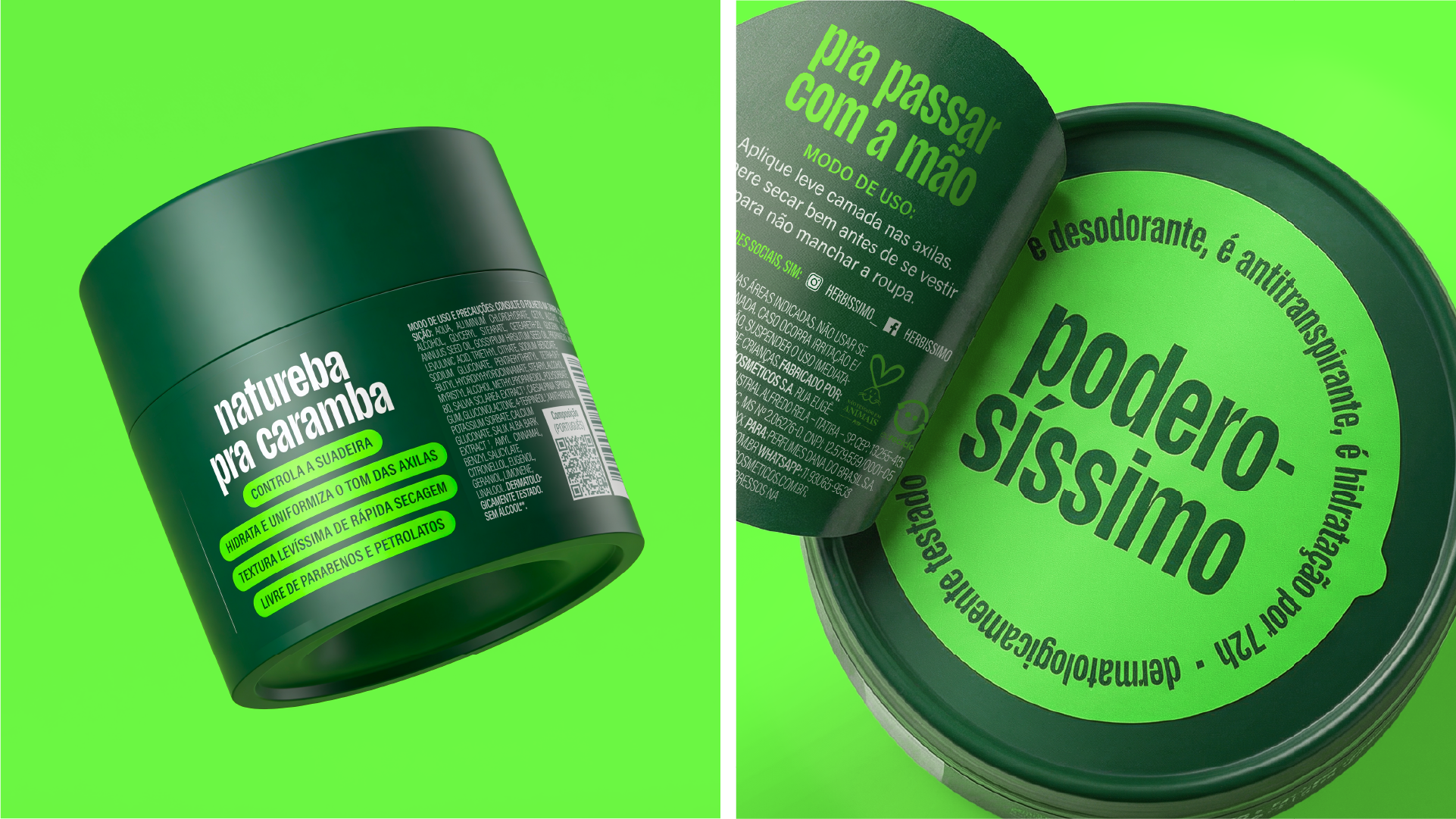
PACKAGING
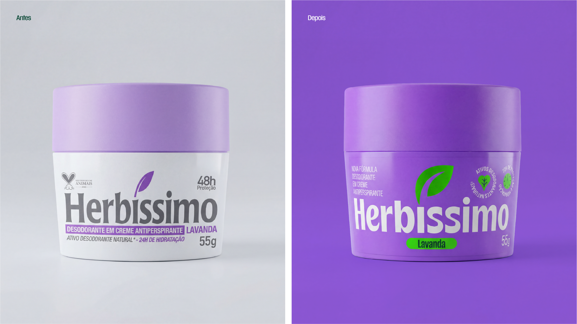
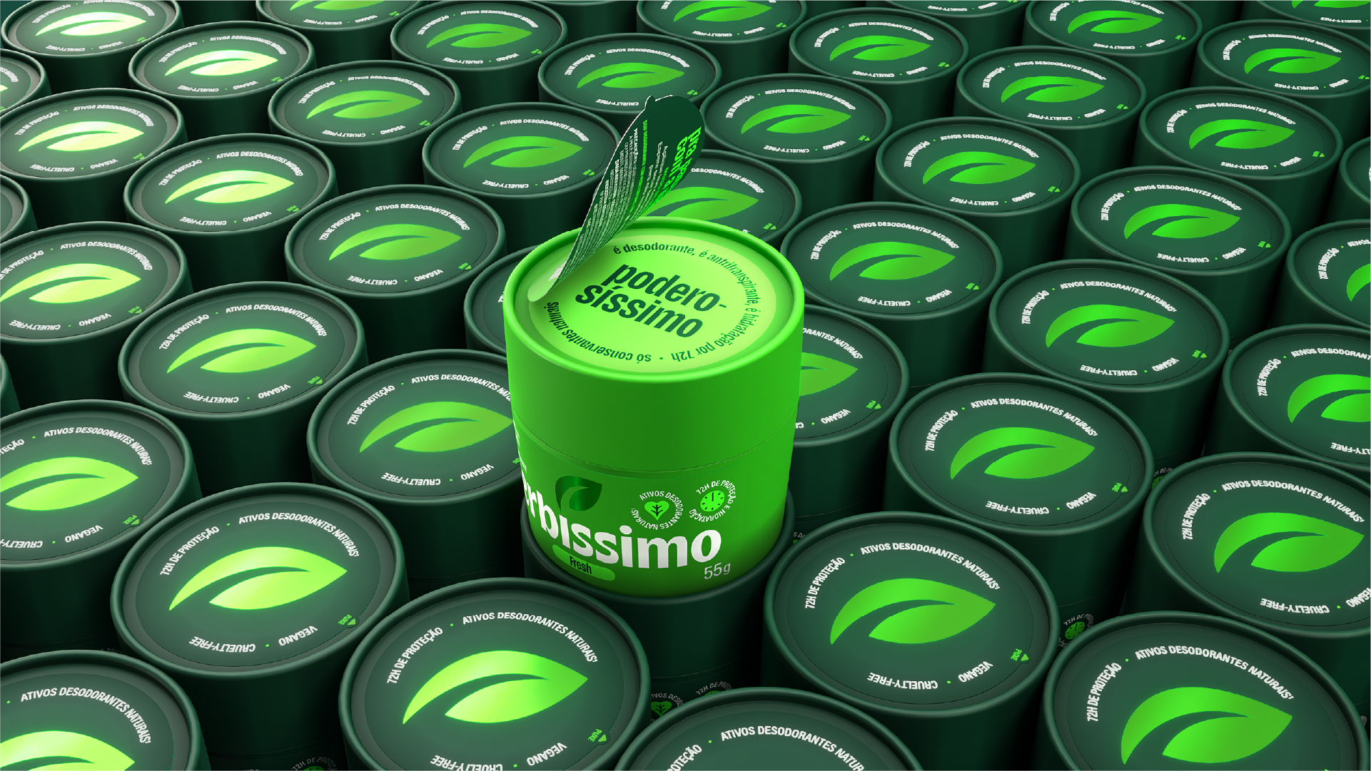
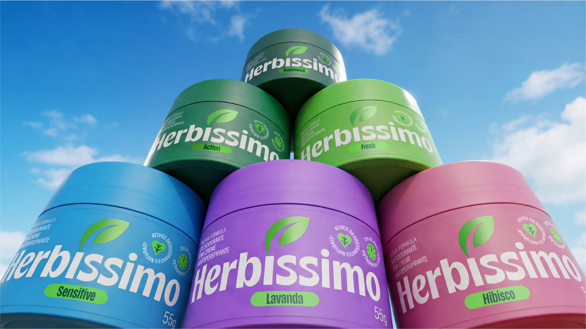
Herbíssimo's packaging emerged as a direct response to a structural challenge: communicating the potency of a powerful product within a compact format. We started from a scenario where the small white jar didn't stand out on the shelf and evolved from a key lesson: color was already, spontaneously, a code of recognition for consumers. "My Herbíssimo is the one with the blue lid."
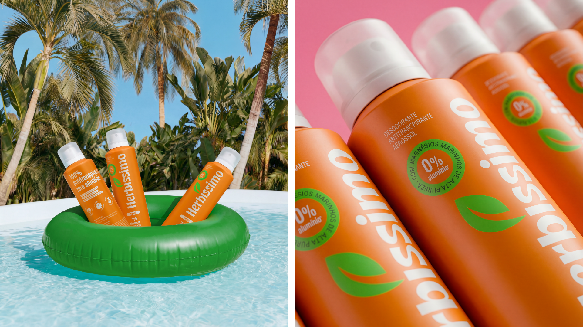
By enhancing this behavior, we brought a splash of color to the bottles, with a vibrant palette that increases visibility, differentiates fragrances, and organizes the portfolio without losing brand consistency. The wireframe was designed for immediate readability, combining illustrative icons, educational text, and a light tone of voice.
In a competitive landscape where shelf placement doesn't always favor front-of-package visibility, the lid becomes a strategic point. Often the first point of contact with the product, it takes center stage by reinforcing differentiating codes and incorporating the concept of a secret club, with messages and details that broaden the connection with the community and expand communication beyond the traditional label.
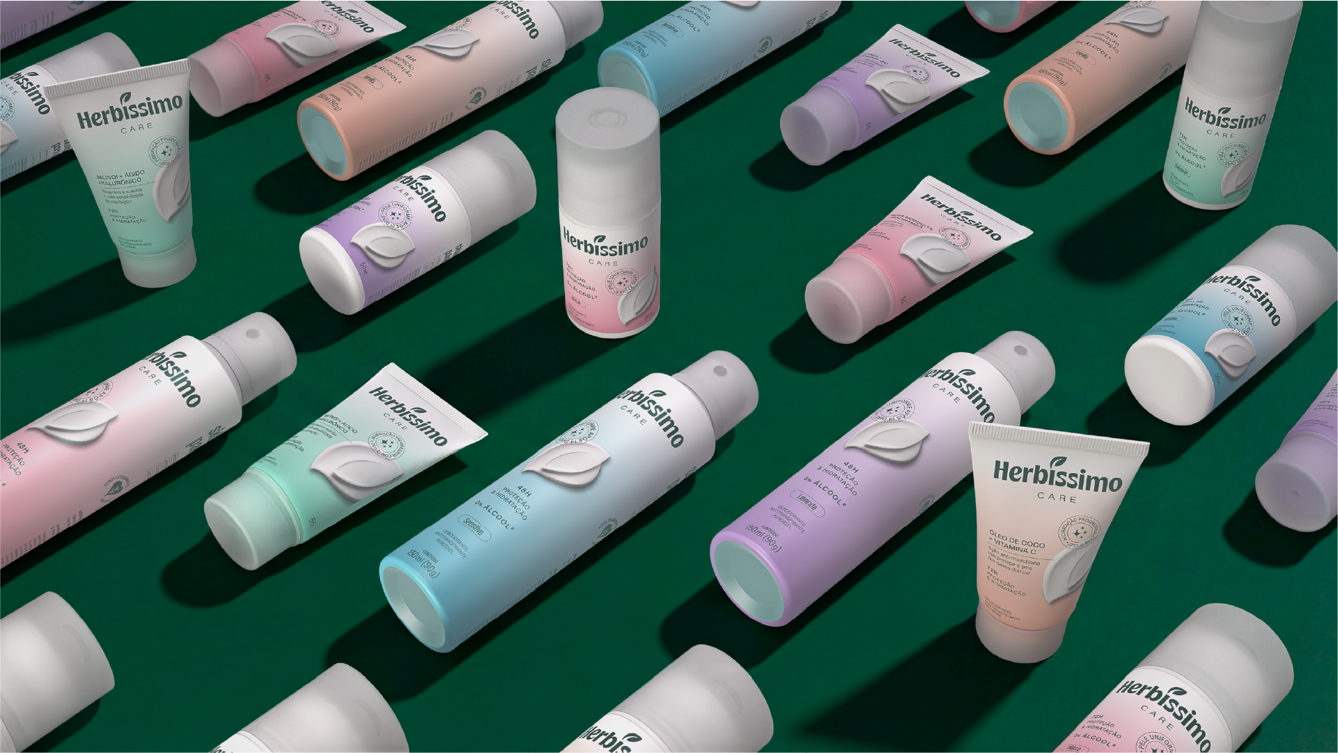
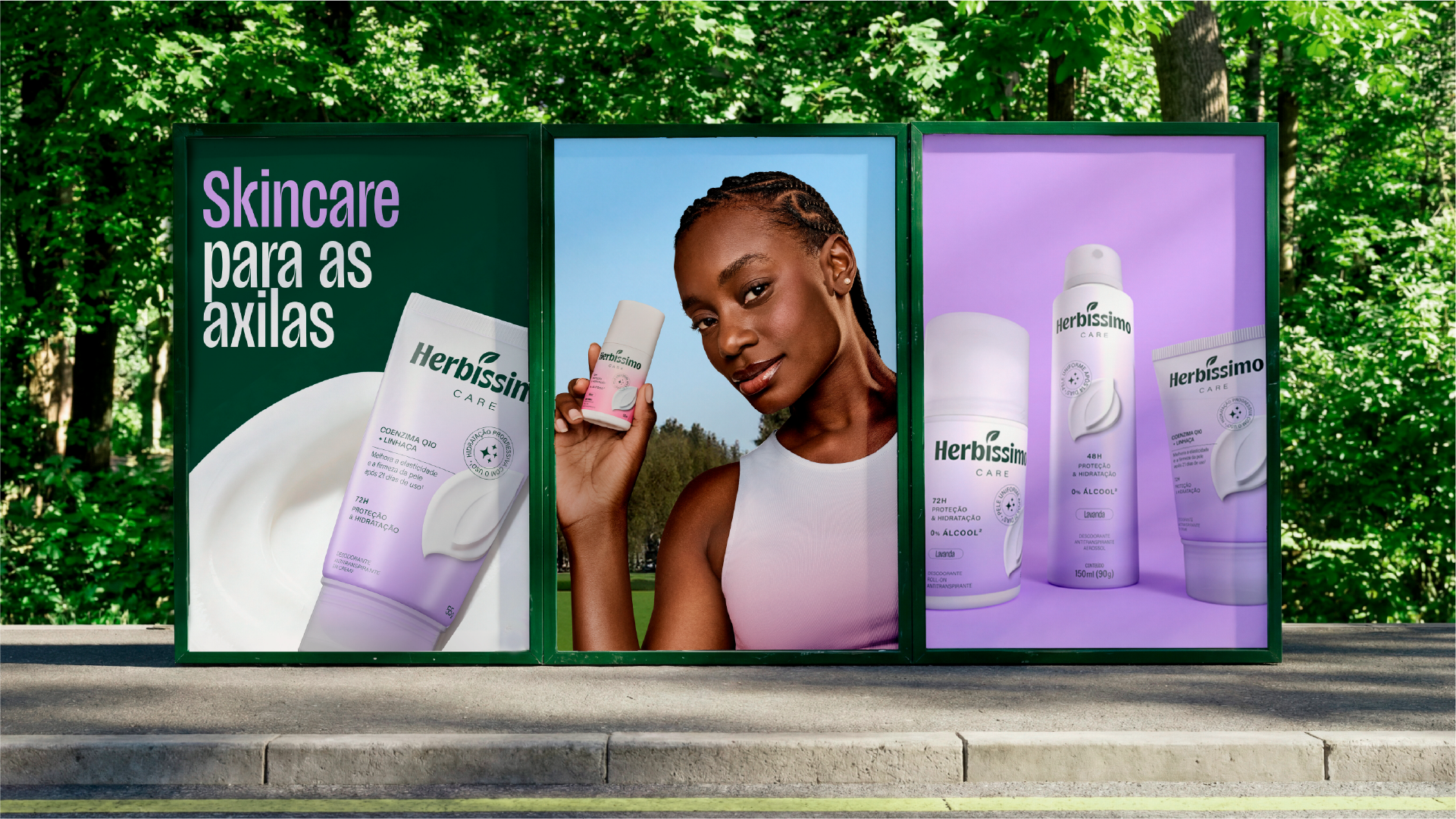
In the Care line, which carries the claim "underarm skincare," this logic evolves into a more sophisticated territory. Under the concept of self-esteem, the differentiation comes from a more refined palette, with the use of gradients and a more prominent typography, which highlights attributes and benefits in a more sensory and careful way.
The result is a packaging system that attracts, organizes, and facilitates choice, bringing the brand to life in the physical experience and enhancing codes already recognized by fans.