



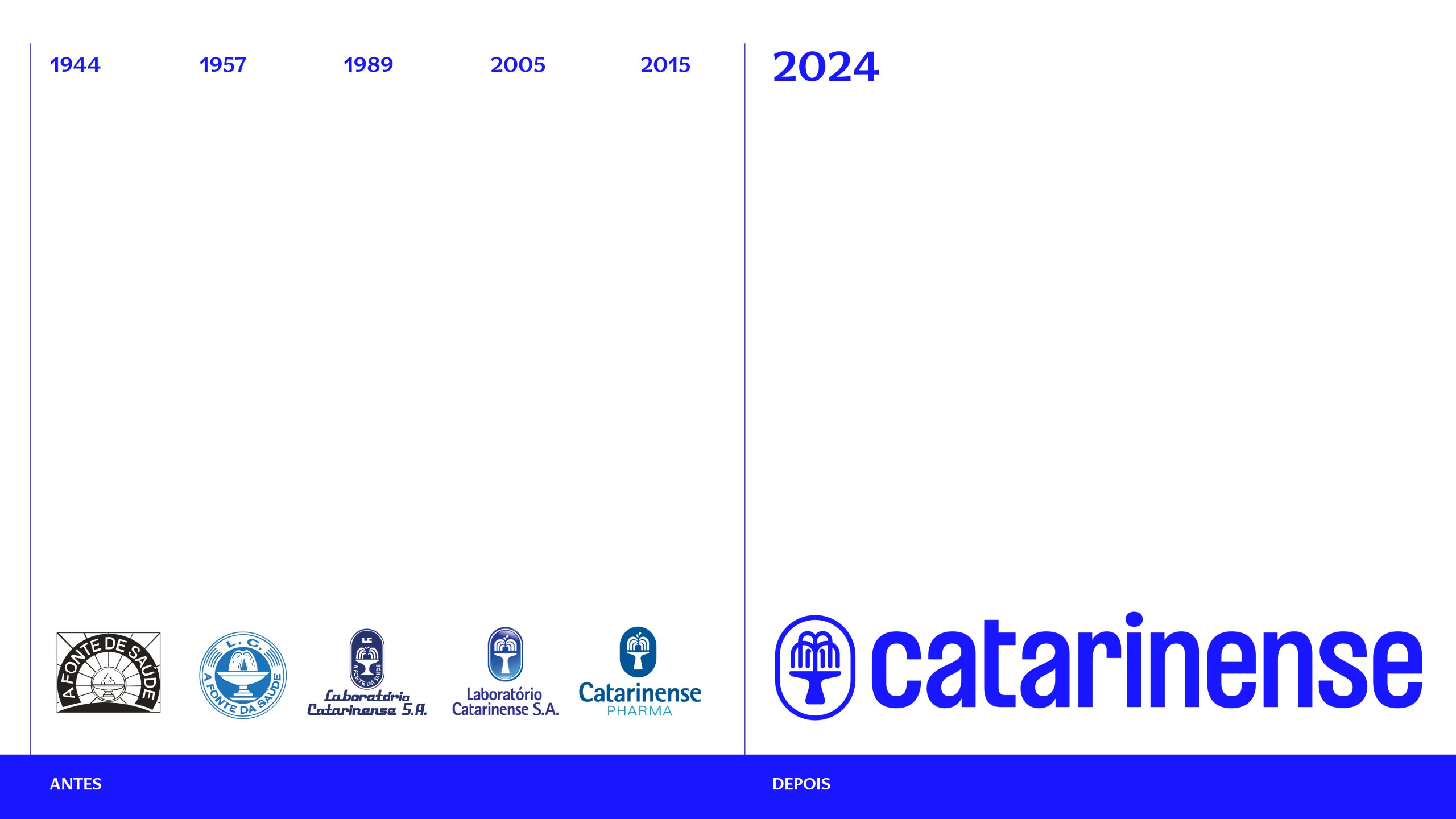

STRATEGY
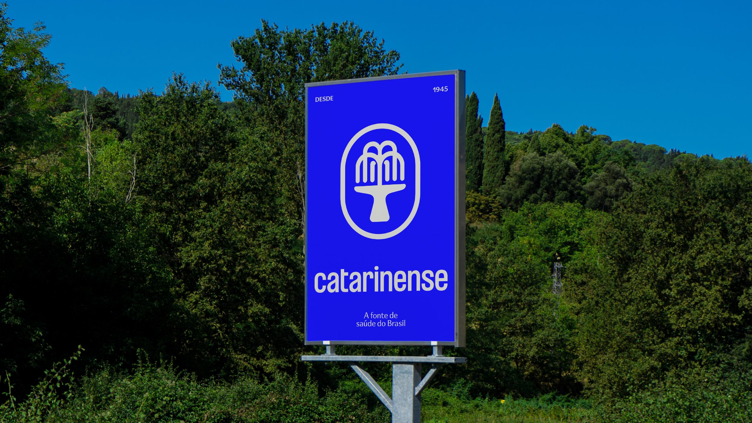
The solution stemmed from the brand's very DNA: its purpose. “"To be a source of health"”. A timeless, genuine pillar connected to what the company has always delivered. From it, we developed a robust repositioning, capable of uniting history and future, care and innovation.
1. The power of origin: the concept of "source"“
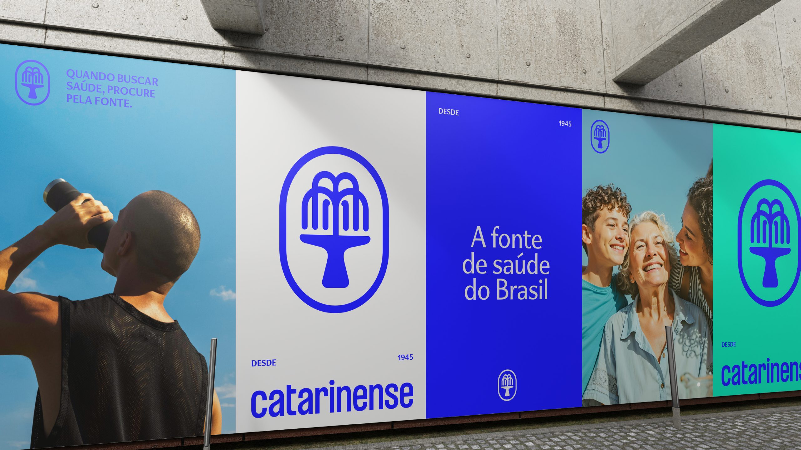
We rescued and redefined the term "fountain" as a symbol of purity, movement, and origin. More than a graphic element, it became the essence that translates the credibility, originality, and commitment of Santa Catarina to health.
2. New architecture and portfolio management
We created a clear ecosystem, led by the umbrella brand from Santa Catarina:
- Historic and renowned brands of quality, such as Melagrião, Sadol, and Figatil, receive clear and consistent endorsement from Catarinense without losing their independence and brand identity.
- Supplements and vitamins: We repositioned “Catarinense Nutrição” to simply Catarinense, consolidating the concept of comprehensive health and strengthening the national presence of the category.
3. Clear and relevant identity
The brand personality was defined as cheerful, kind, demanding, and proactive—a way of communicating care with rigor and optimism. The new tagline encapsulates this truth:
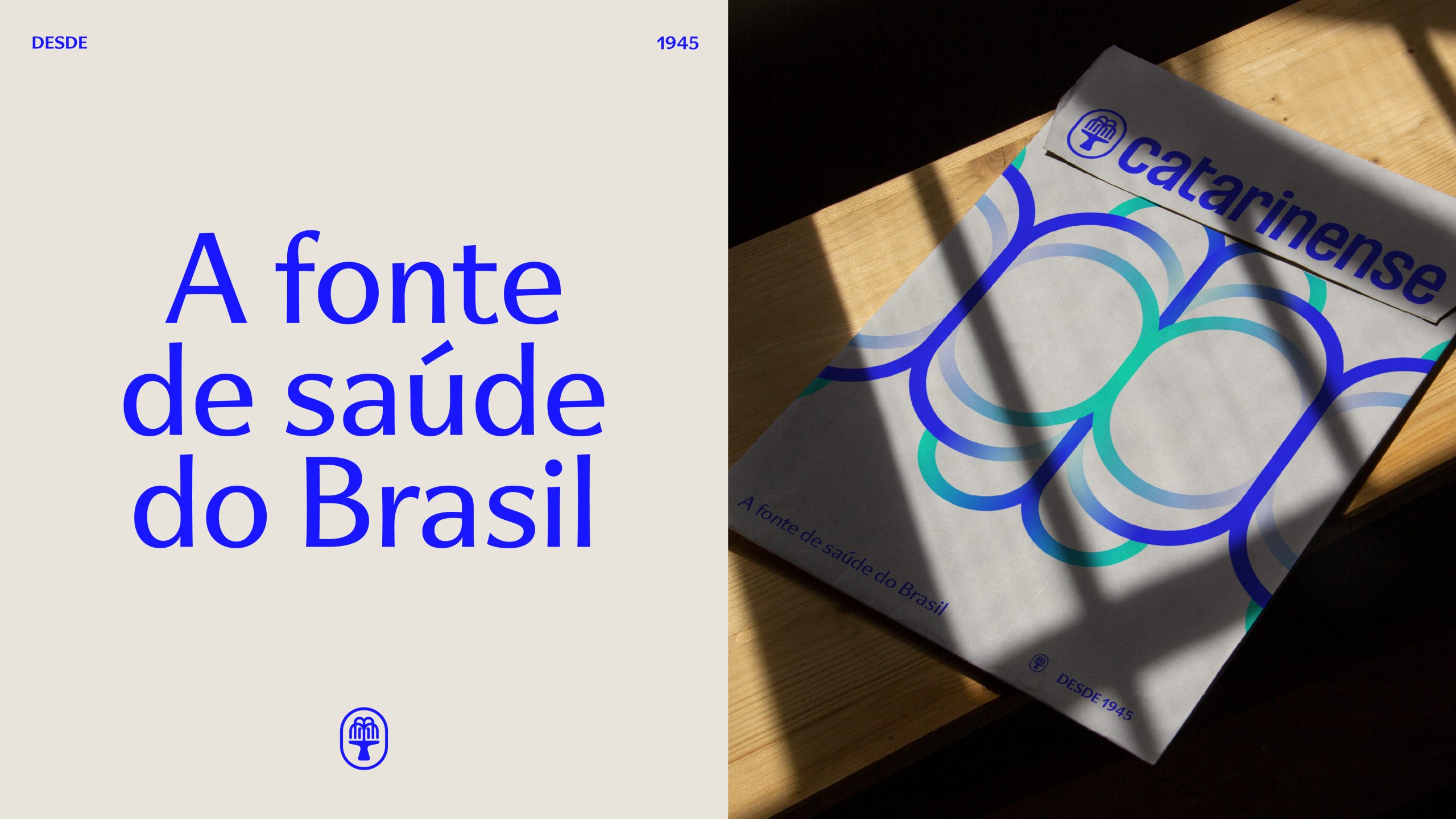
Catarinense. The source of health in Brazil.
This rebranding was a gesture of recognition: reaffirming a purpose that already resonated within the company's history, transforming its legacy into a source of health for even more Brazilian families.
BRAND AND CREATIVE PLATFORM
The goal was to modernize the Catarinense brand to consolidate it as a national leader in healthcare, without losing its connection to its history. The new identity needed to reinforce the trust earned over eight decades, while simultaneously expanding its relevance to the end consumer. With a focus on digital, health education, and portfolio innovation, the rebranding strengthens the positioning of "Source of Health," connecting the company to a broader audience attentive to well-being, longevity, and quality of life.
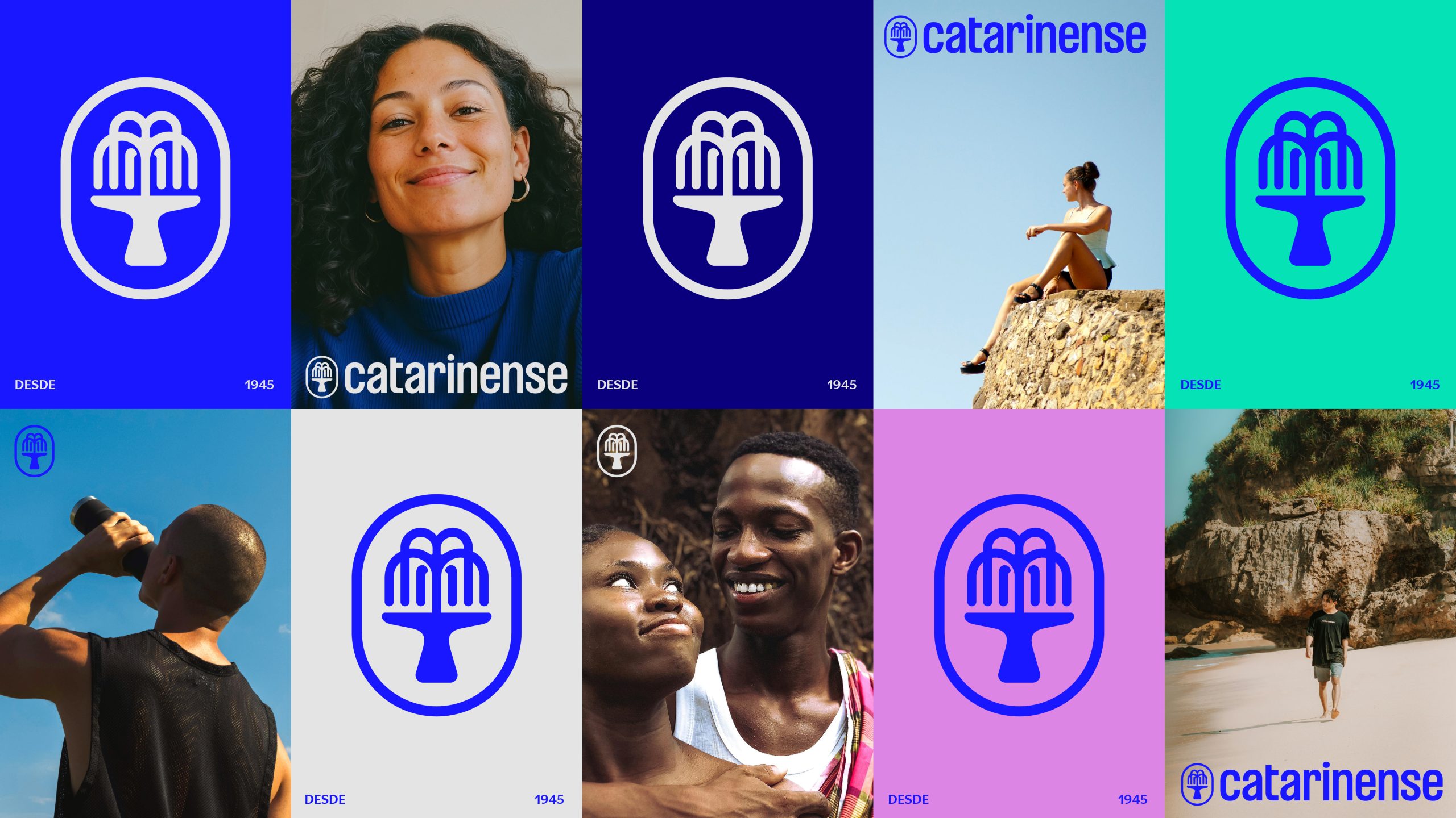
The Catarinense brand design translates tradition and future into a unique identity. The updated logo preserves the geometric essence but gains fluidity and vitality, with typography inspired by history and more vibrant colors that symbolize energy and confidence. The removal of the word "Pharma" broadens the connection with the end consumer, reinforcing the purpose of being a "Source of Health". The new identity strengthens its national expansion, uniting innovation, health education, and a narrative that overflows with care and closeness.


VERBAL
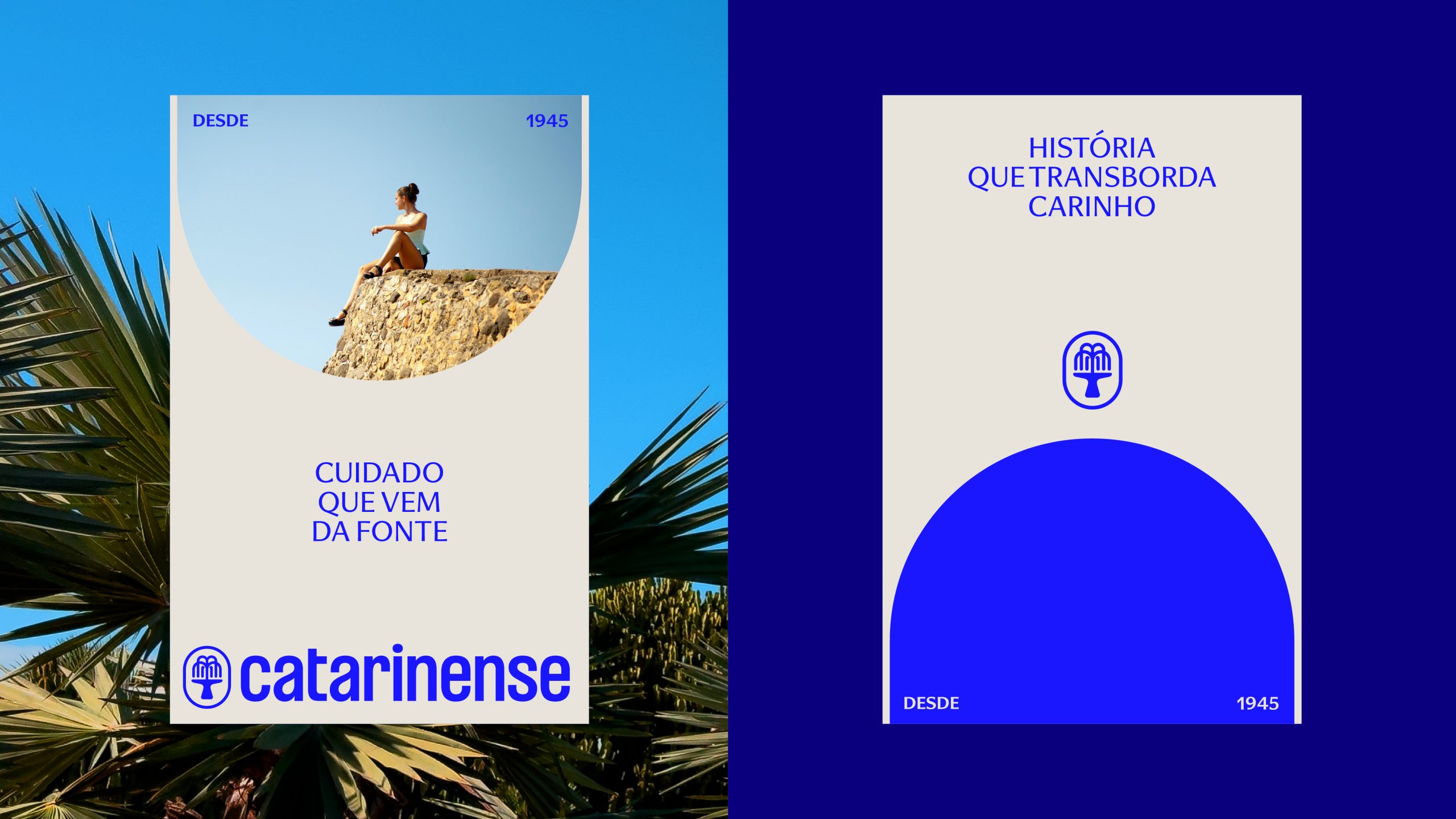
Catarinense's tone of voice expresses a joyful and wise way of speaking, expanding the meaning of care and "source" to talk about the excellence of his practices, his appreciation for legacy, and his work to improve the future and well-being of Brazilians.
In titles such as "A story overflowing with affection," "Excellence is our main raw material," "Knowledge that cares, endures," and "A source of health, a source of the future," Catarinense seeks to be recognized as the source of health, kindness, and knowledge in Brazil.


