STRATEGY
We understand that its differentiation went beyond the innovative characteristics of its cladding solutions, in its ability to enable new approaches in architectural projects, enhancing the talent of Brazilian architects to practically transform any environment. Thus, the purpose…“Reimagining spaces with Brazilian energy.”"It became the guiding thread that aligns brand, business, and communication.".
Their performance challenges the status quo of the category. The brand now offers solutions that bring new perspectives, allowing the sophistication of wood texture to reach previously unimaginable places, simplifying complex construction processes. It's a delivery that combines vibrant functionality with welcoming aesthetics, where sustainability acts as the engine of innovation, replacing natural extraction with responsible and clean processes. Forming a collaborative ecosystem, a means of joint evolution and reinvention for architects, retailers, and partners.
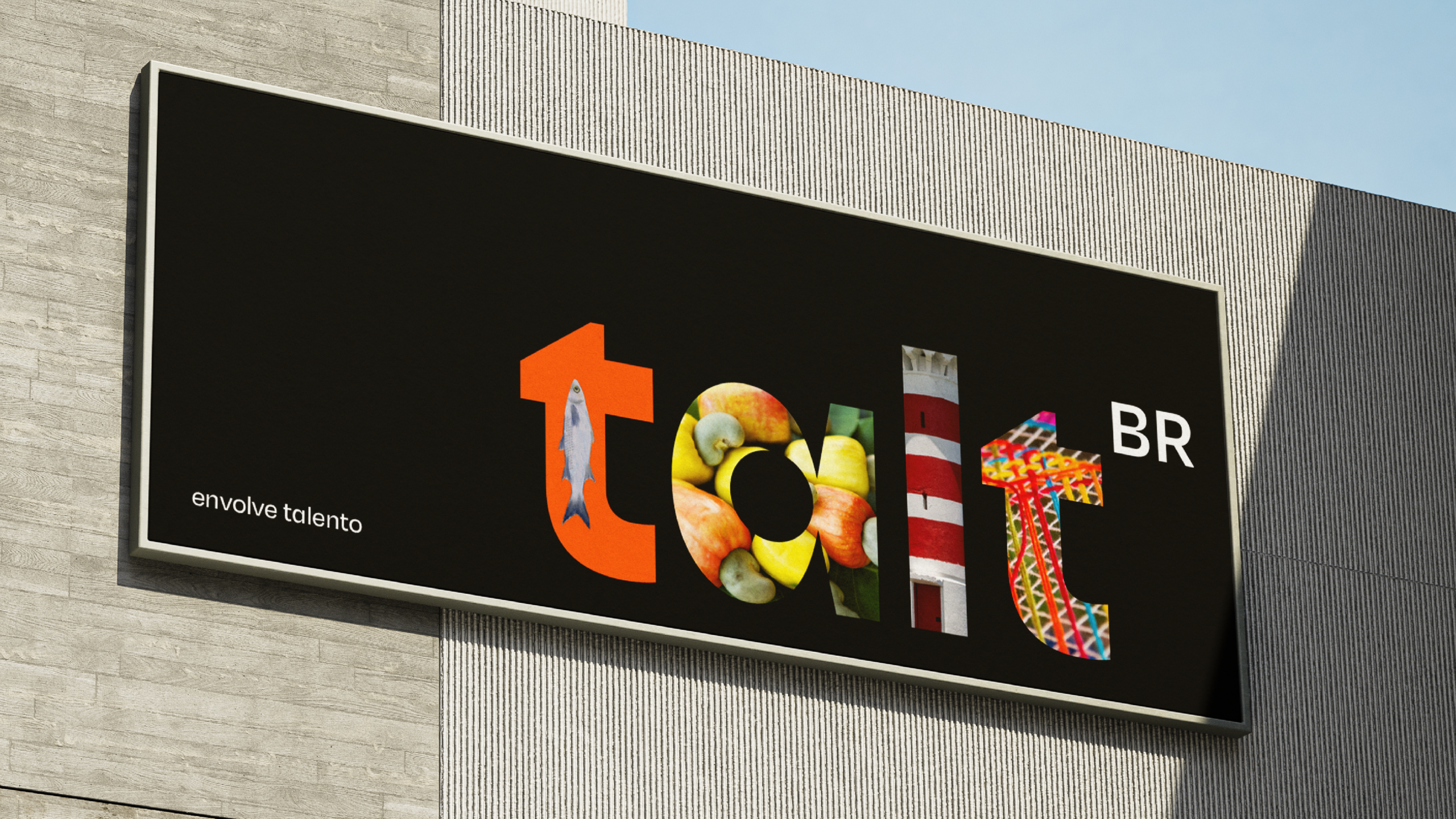
With a creative, charming, memorable, and charismatic personality, this strategy was materialized in a clear and compelling promise, summarized in the tagline: Talt. It involves talent..
CREATION
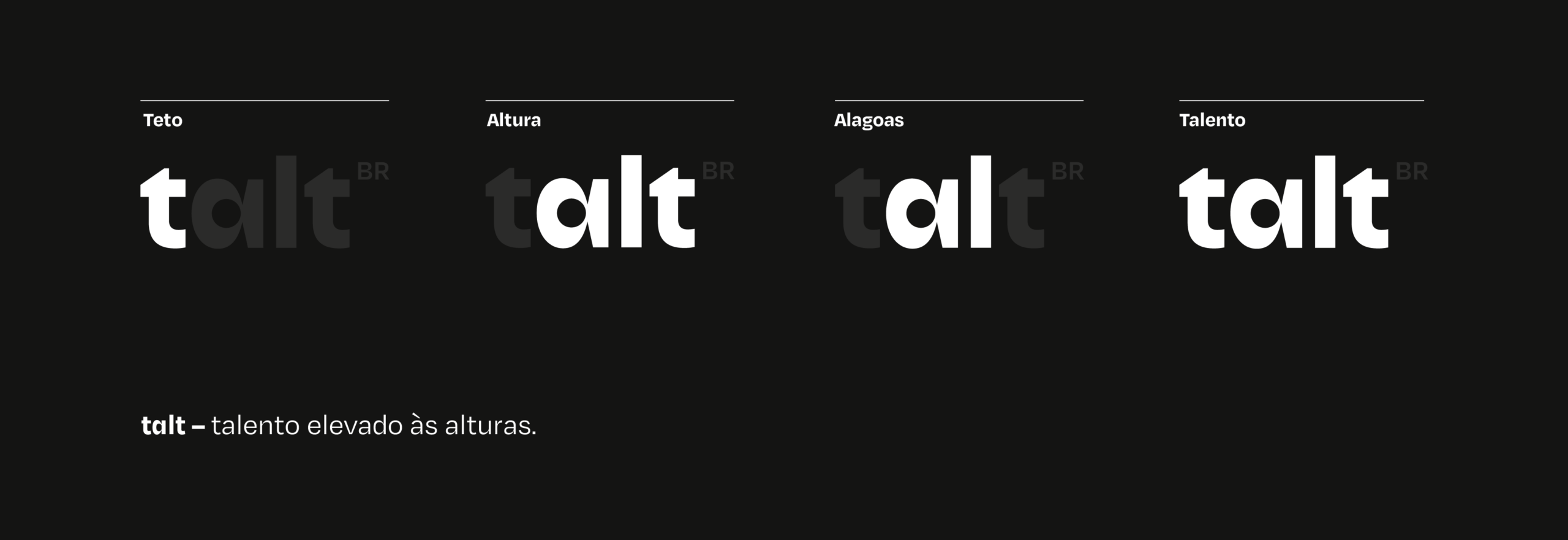
To inaugurate this new phase and honor the company's roots, the name was born. Talt, which means "talent elevated to the heights." A short and architectural name that awakens the sense of touch, referring to feeling the environment and enveloping the senses from floor to ceiling. Talt also carries, in addition to the letters of the other names, the acronym "AL," keeping Alagoas at the heart of the brand as a subtle and essential reference to its origin.
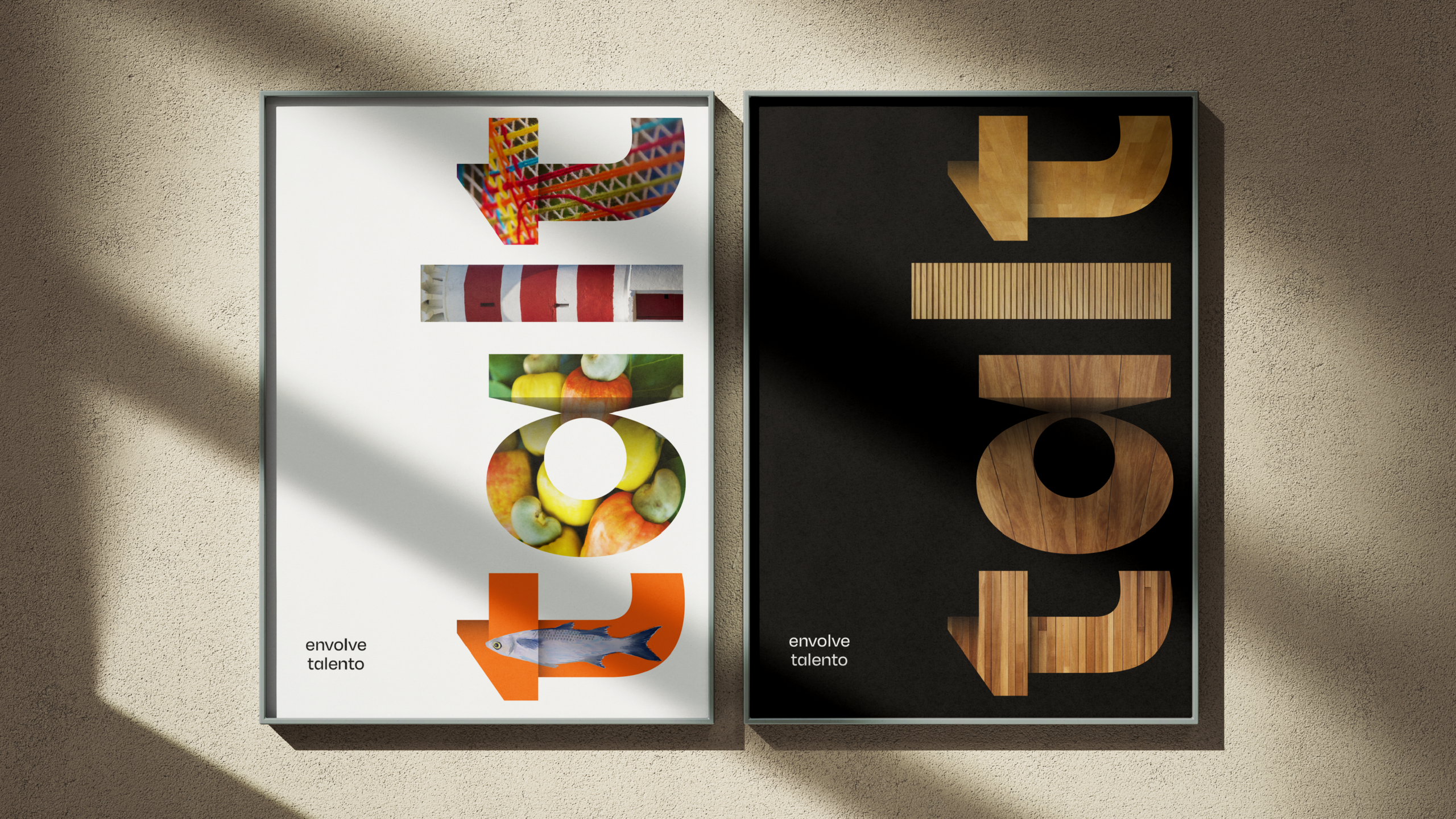
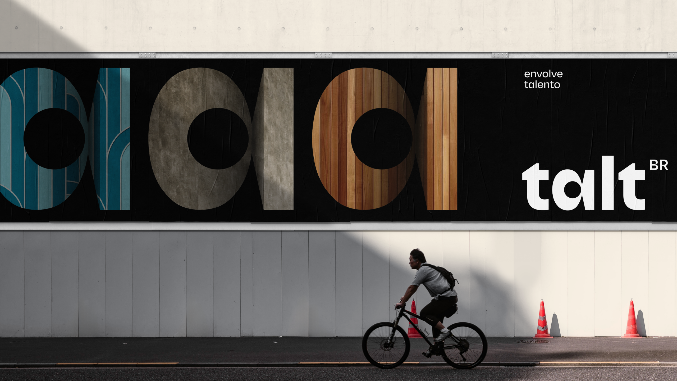
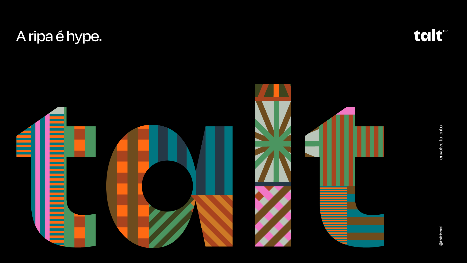
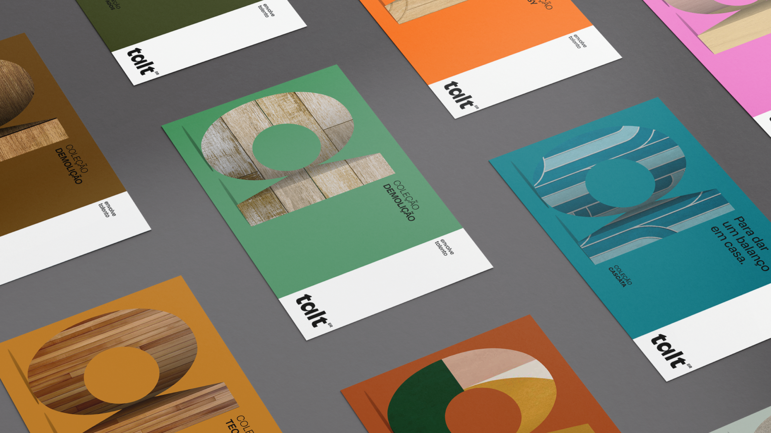
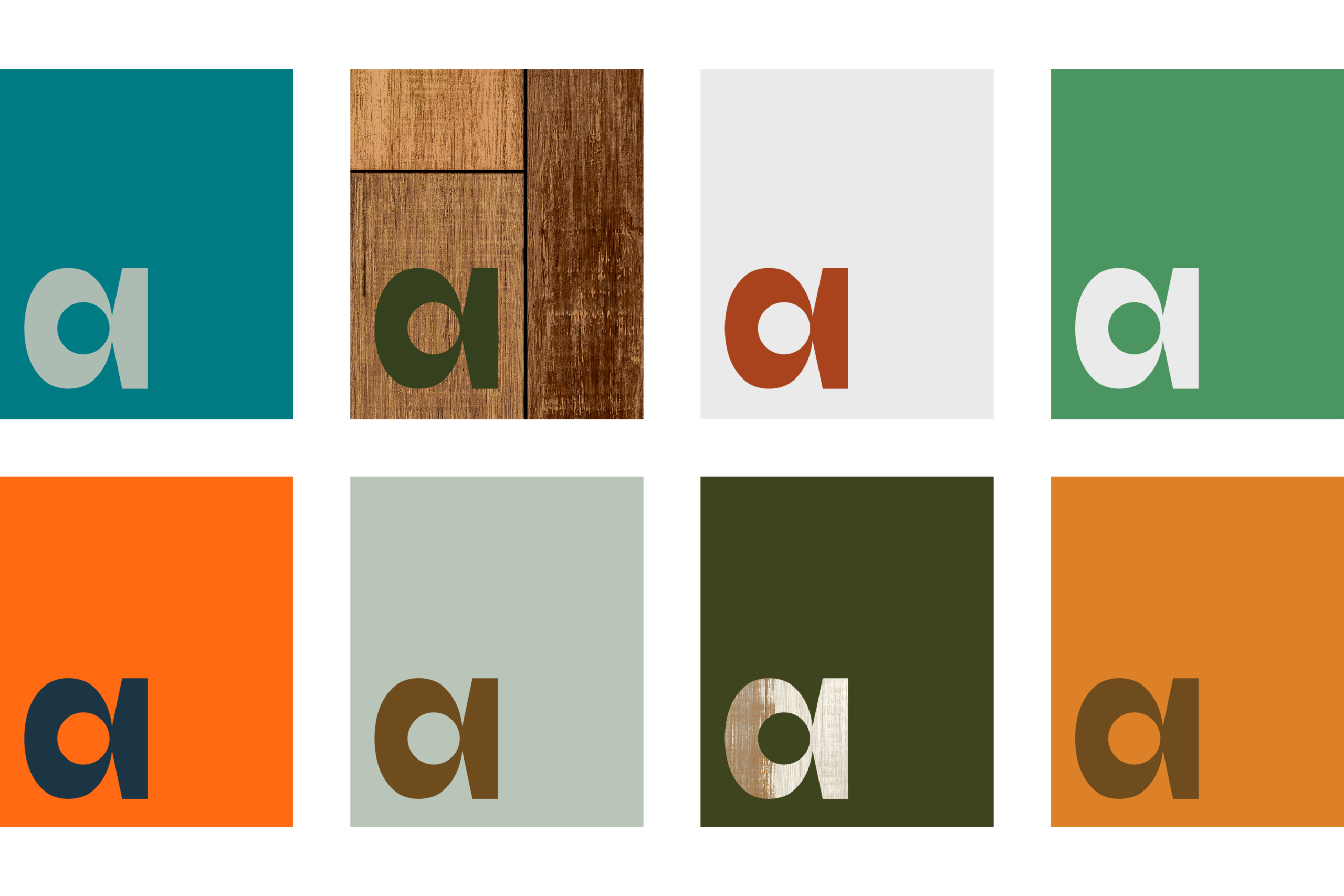
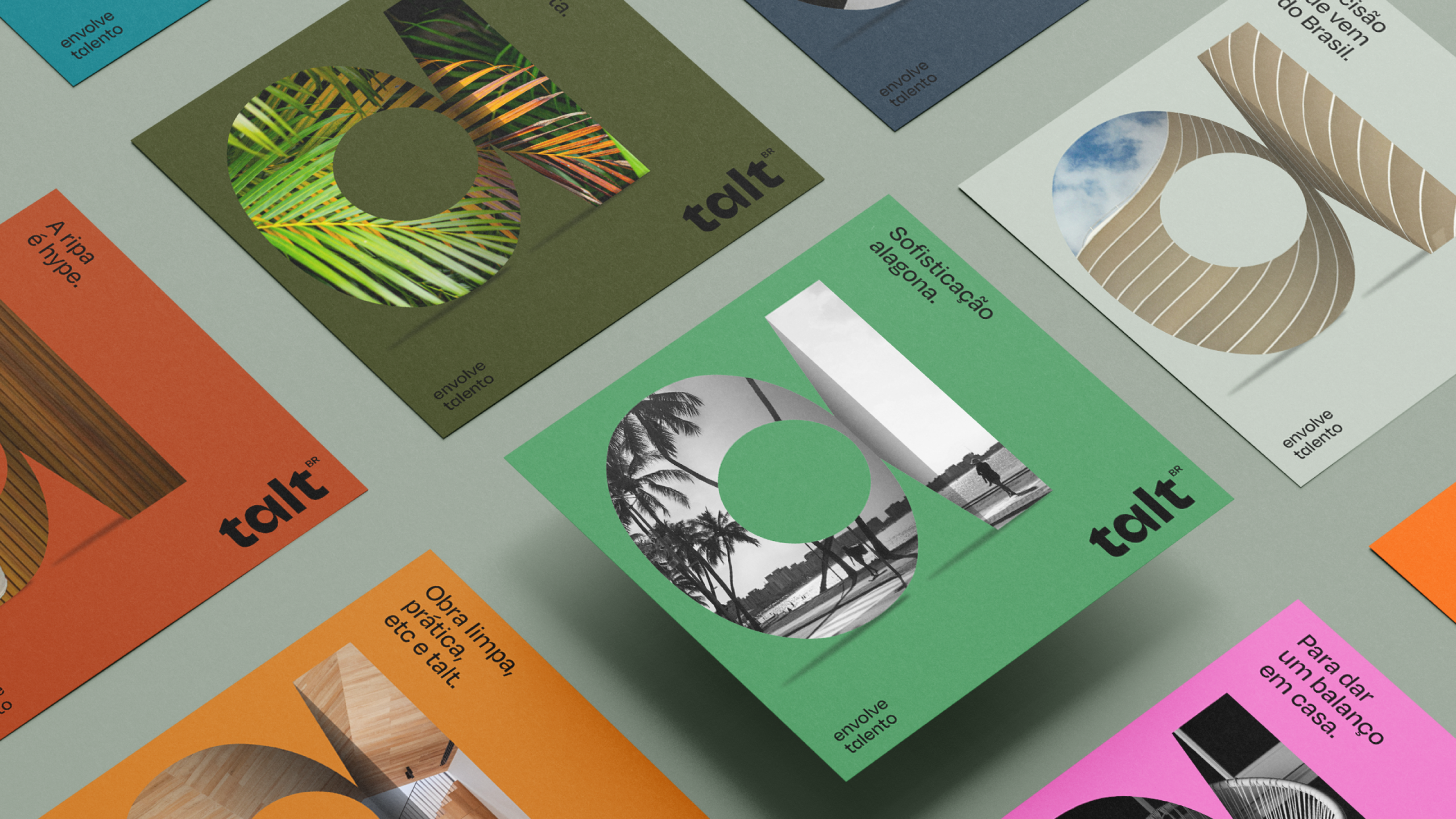
The visual universe makes tangible the sophistication of national architecture through a object-marker: a logo designed with volume and depth that functions like a container.
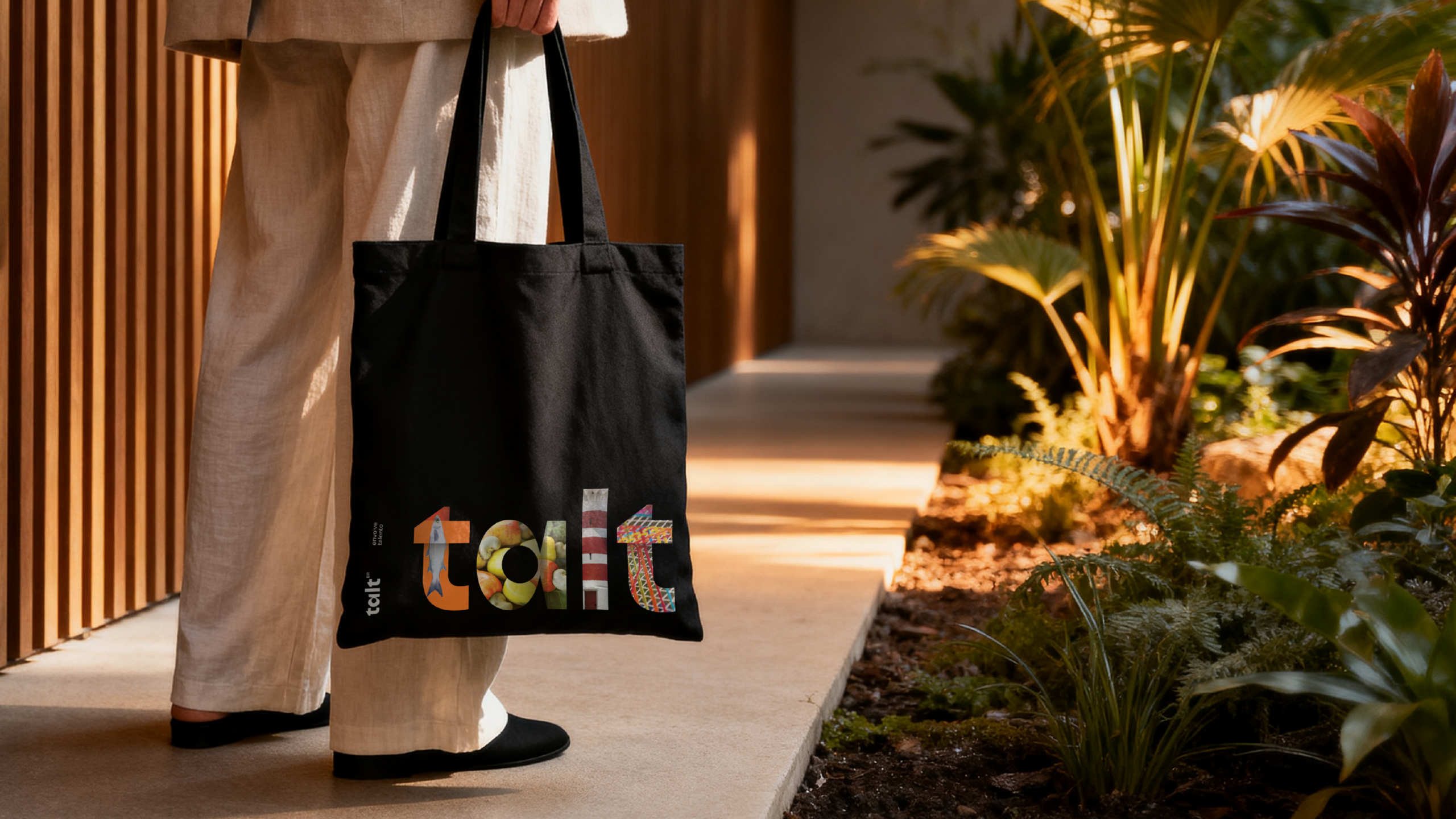
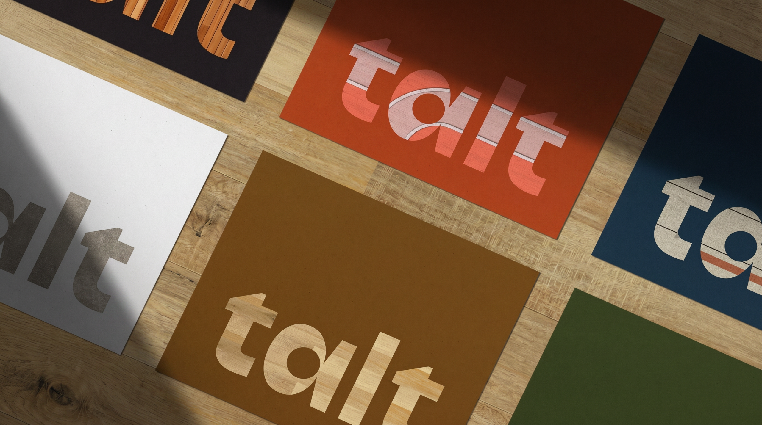
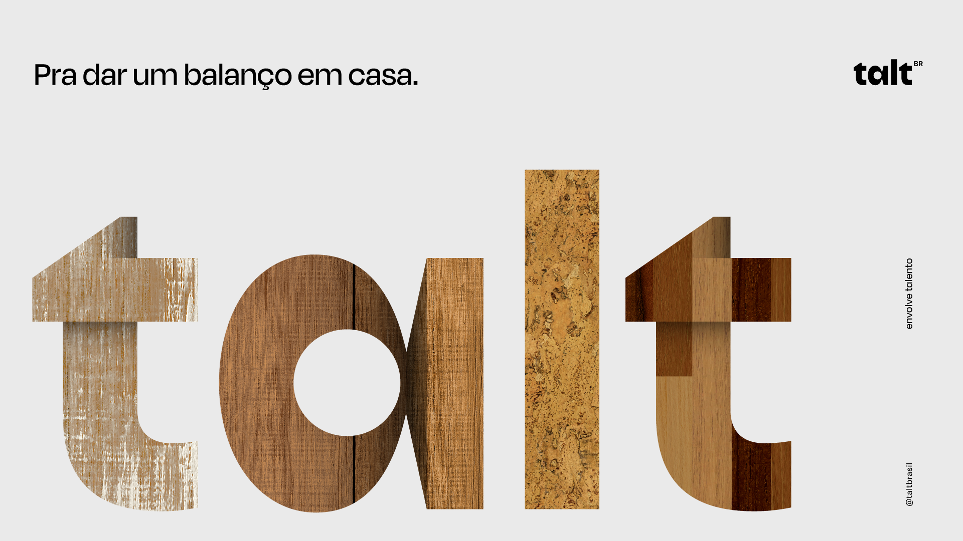
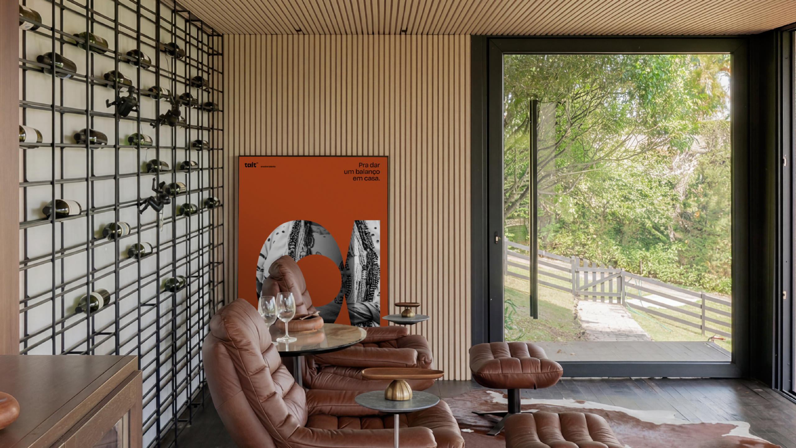
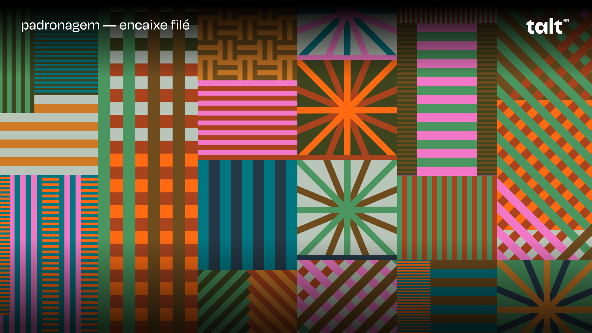
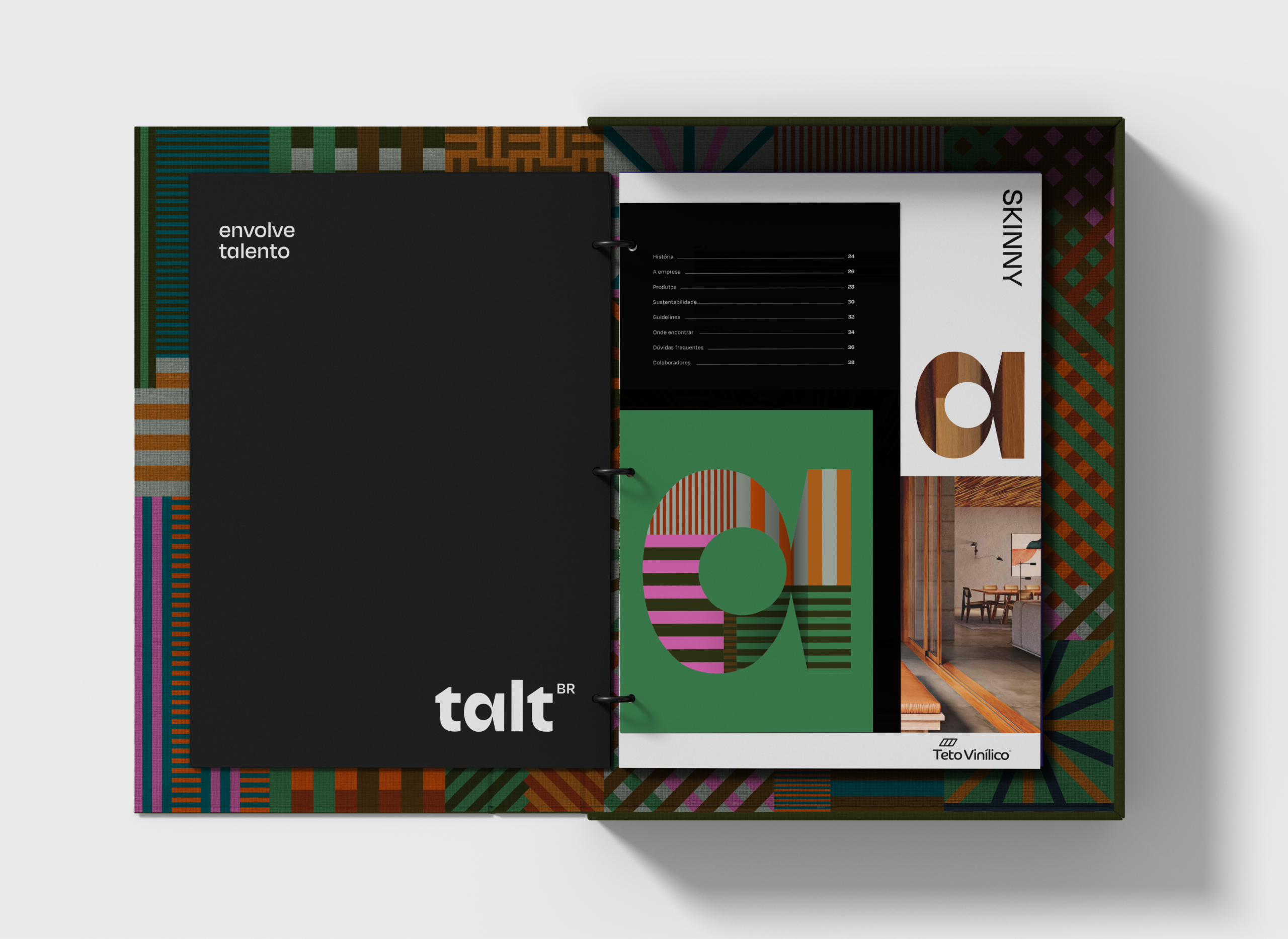
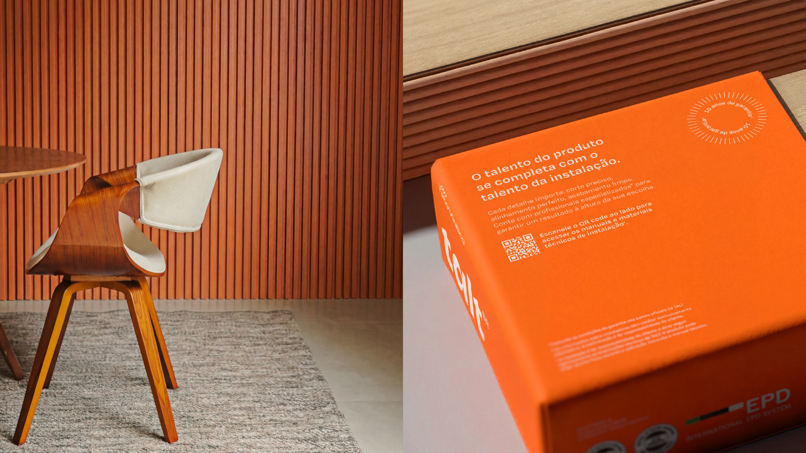
The brand is dynamically coated with the textures of the products themselves, making the design a direct extension of the physical material. Accompanied by an architectural typography and a color palette inspired by Brazilian plurality, the identity avoids clichés to celebrate contemporary sophistication, resulting in a... a brand imbued with meaning.
The visual universe makes tangible the sophistication of national architecture through a object-marker: a logo designed with volume and depth that functions like a container.
The brand is dynamically coated with the textures of the products themselves, making the design a direct extension of the physical material. Accompanied by an architectural typography and a color palette inspired by Brazilian plurality, the identity avoids clichés to celebrate contemporary sophistication, resulting in a... a brand imbued with meaning.

EXPERIENCE
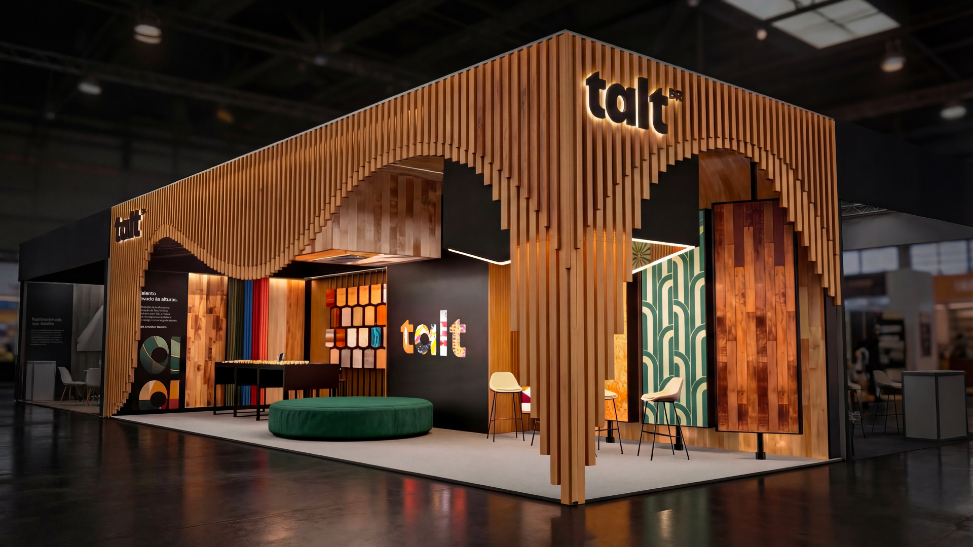
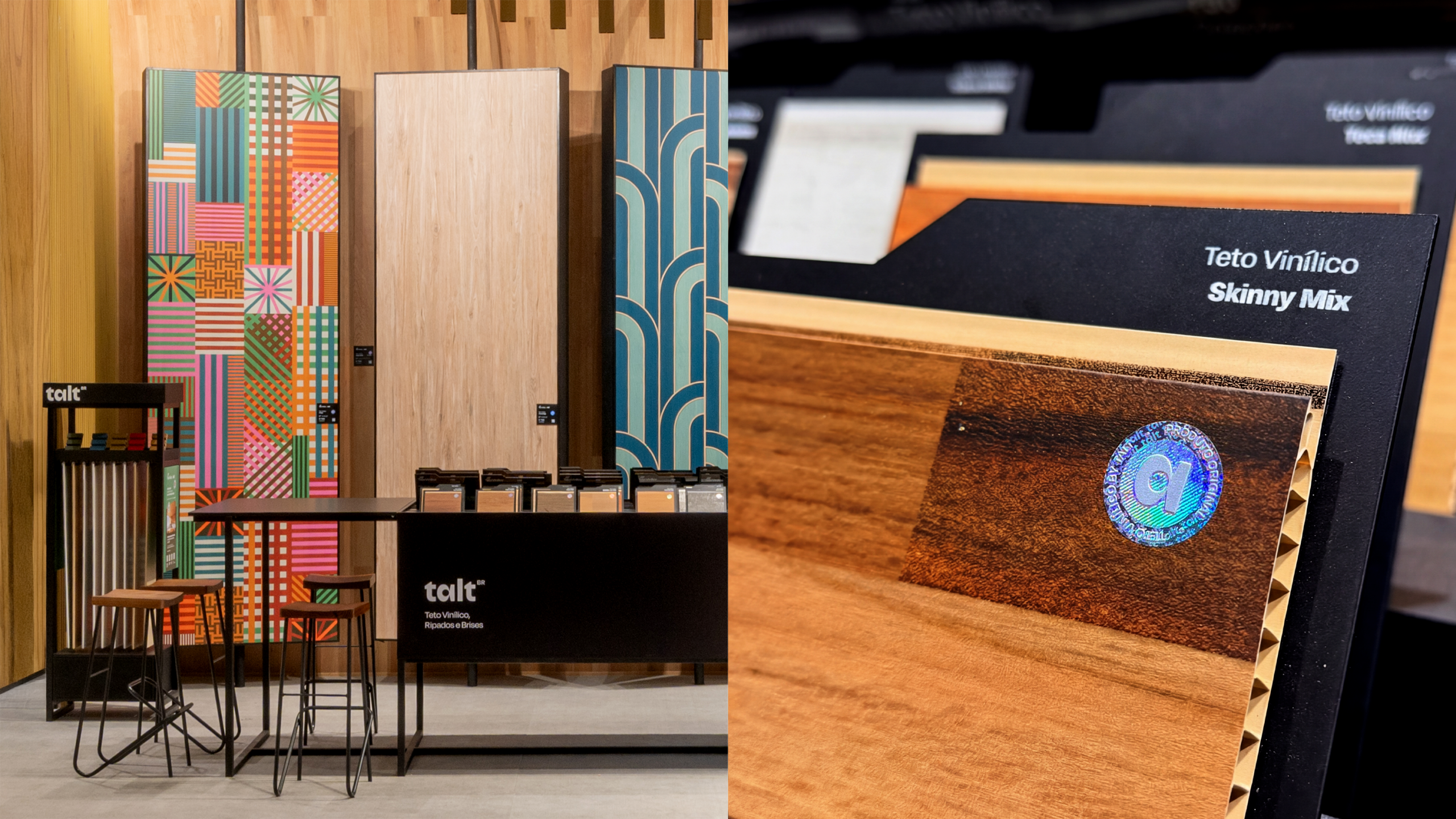
Talt's rebranding was launched at Expo Revestir through an immersive experience that tangibly translated its new positioning. The stand was conceived as a living catalog, with the sample table as the central element, encouraging direct interaction and sensory exploration of the portfolio. Activations such as the press kit and the space's narrative created an intentional flow of visitors, increasing engagement with the brand.
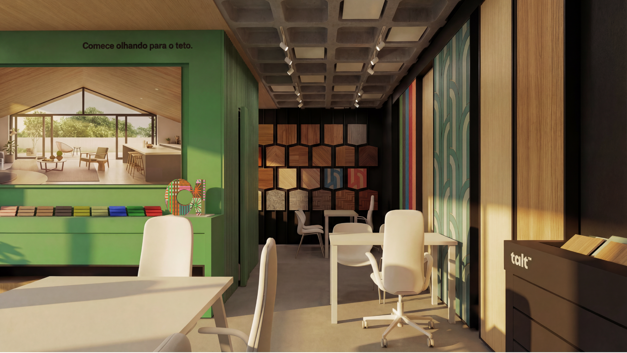
From this launch, the experience evolved to the point of sale, with the development of modular materials that adapt to different resale formats and reinforce contact with the product. The pieces support the salesperson and encourage the consumer to touch, compare, and understand the materials, thus improving the quality of the purchase decision.
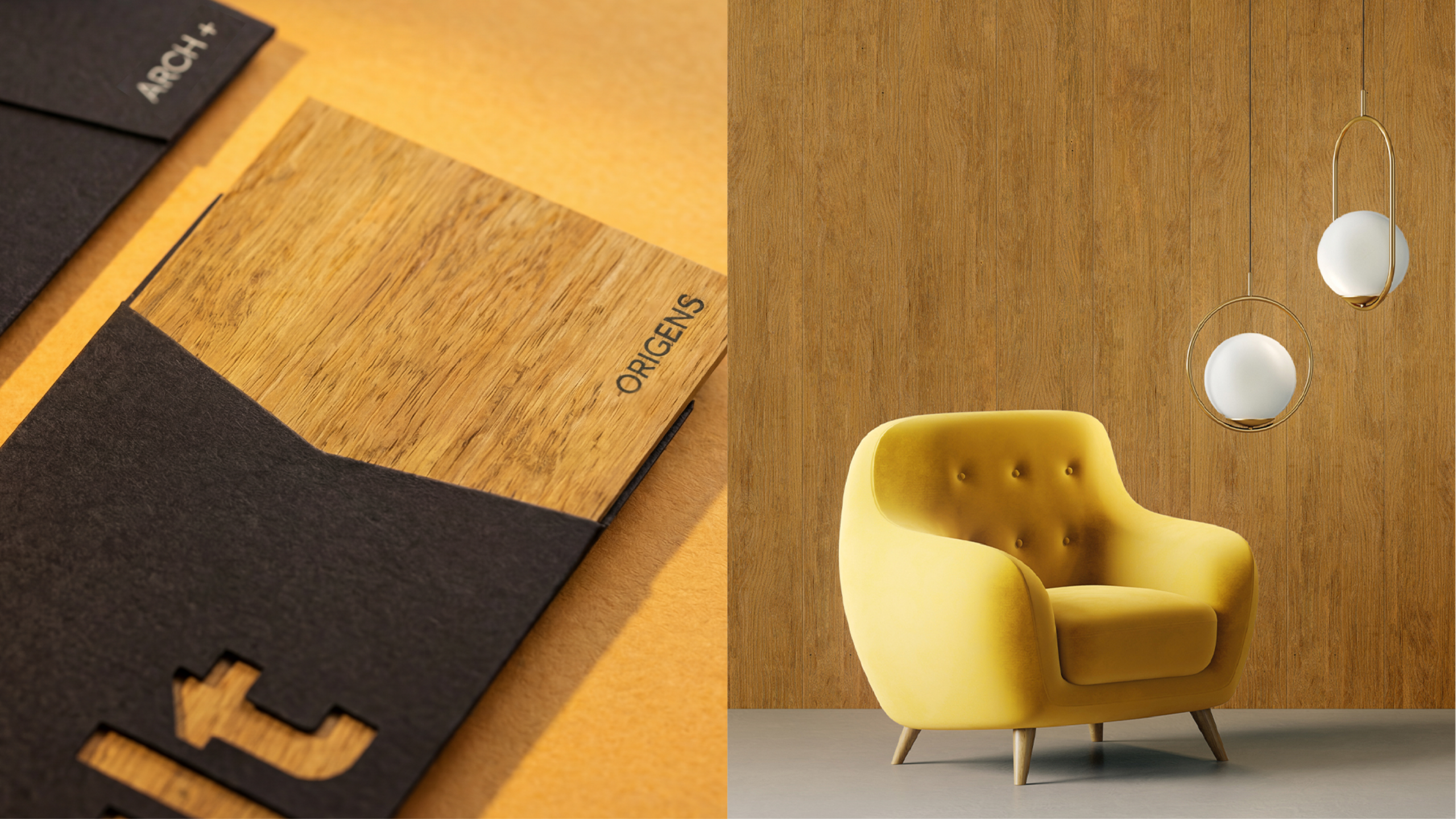
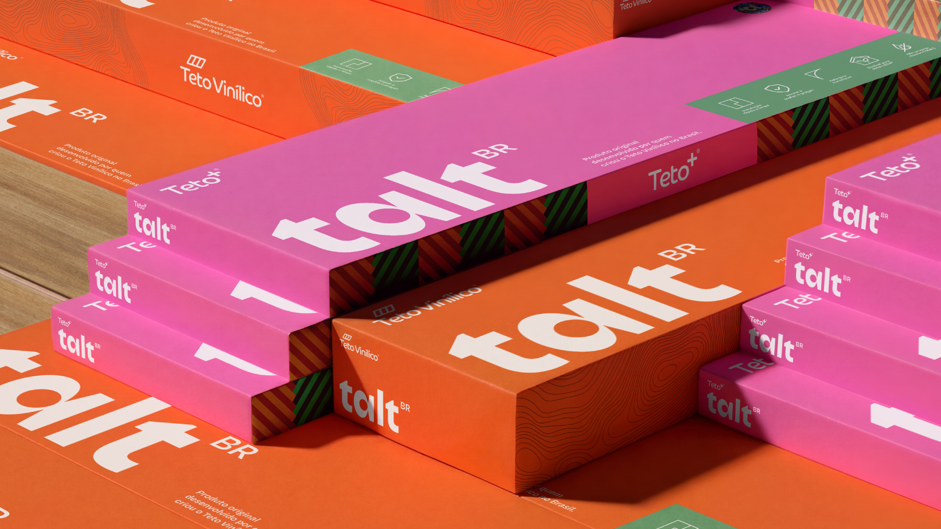
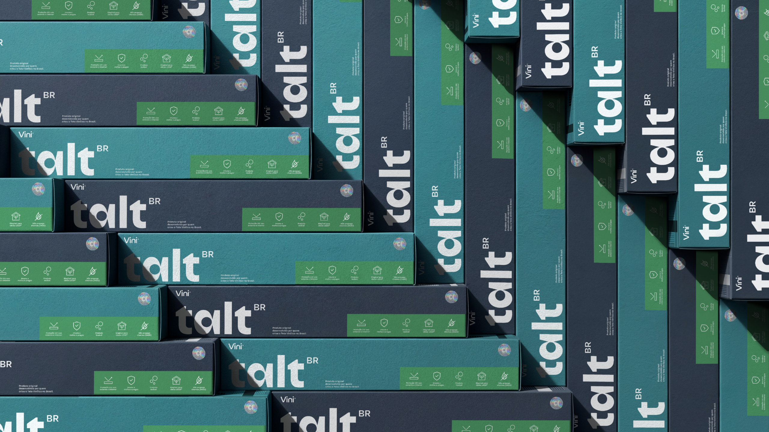
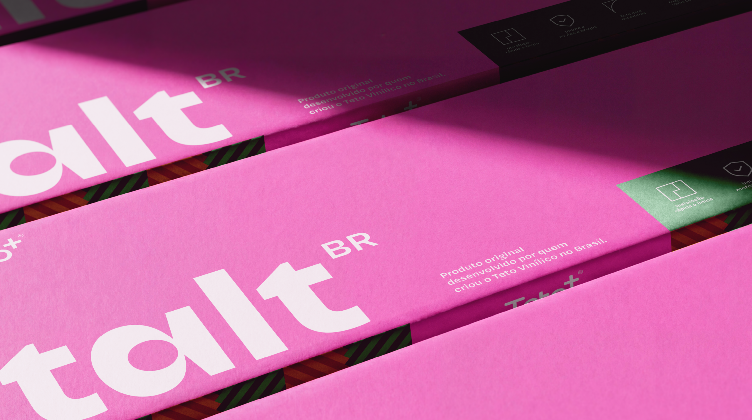
Packaging complements this journey by facilitating the identification of product lines and embodying the brand's purpose. Designed in a modular way to adapt to the different product formats, the packaging is reusable and functional. In this way, it contributes to a more organized and sustainable project, transforming an operational element into another strategic point of contact.
Thus, Talt builds a consistent experience that connects enchantment, functionality, and purpose throughout the entire journey.